Sticky positioning is a combination of relative and fixed positioning. Basically during scrolling, a sticky positioned element behaves as if it is relatively positioned until it goes beyond a specified point. If there is another sticky positioned element at that point, it is replaced. To specify sticky positioning for an element, sticky is used as the value of the position property and a box offset property is used to specify the “sticky point.” Figures 12.12 and 12.13 show how this is done and the effect.

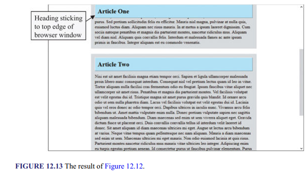
In the example, as the user scrolls down, the “Article One” heading moves up, and when it gets to the top edge of the browser window it stops there and remains there as the user continues to scroll down until the “Article Two” heading gets there to replace it. The .art1{} and ,art2{} rules specify the styles for the two <div> elements. The auto values specified for the right and left margin ensure that the elements are horizontally centered in the browser window. In the h2{} rule, the position:sticky and top:0px declarations say to apply sticky positioning at Opx from the top of the browser window.
1. Sticky Global Navigation
Another common application of sticky positioning is its use to make global navigation remain in view while a page is being scrolled up and down. Figures 12.14 and 12.15 show the codes for demonstrating the application and Figure 12.16 the result.
In the example, the body{} sets the width of the page to be 90% of the browser window and centers it horizontally with the margin property. The header{} rule sticky positions the banner and the menu Opx from the top edge of the page. The .logo{} rule specifies the height and background color for the banner and centers the <hl> element inside it. To align the <hl> element properly the .logo hl {} rule sets its top margin to Opx to remove it and adds padding at the top. The nav li{} specifies Opx margin and padding and a pink background for the <ul> element and also makes its width 100% that of the containing element (i.e., <nav> element), which is the same width as the <header> element. The nav ul li{} rule displays the <li> elements as inline-block elements (i.e., horizontally), centers the text inside them, and makes each 25% of the <ul> element. The nav ul li a{} rule changes the <a> elements to block elements so that padding can be added to them. It also removes the underlining (with text-decoration: none declaration) and makes the text bold. The nav ul li a:hover{} rule says to change the background color of the <a> elements to violet and the text color to white when the cursor is over them.


Source: Sklar David (2016), HTML: A Gentle Introduction to the Web’s Most Popular Language, O’Reilly Media; 1st edition.