Text-based form inputs have a pLacehoLder attribute that lets us add a hint about what kind of data the field expects:
<form>
<p>
<label for=”subscriber_email”>Your email address</label>
<input type=”email” name=”subscriber_email” id=”subscriber_email”
→placeholder=”yourname@example.com”>
</p>
</form>
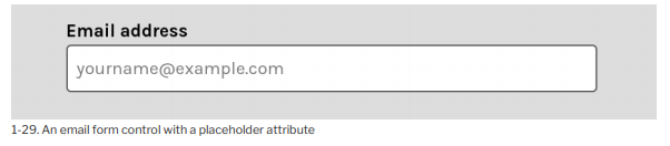
Most browsers display the value of the placeholder attribute within the form control as black text with a reduced opacity, as pictured below.
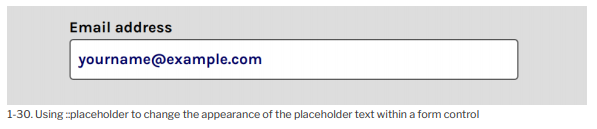
We can change the appearance of this text using the ::pLacehoLder pseudo-element selector. Let’s change the color and size of our placeholder text:
::placeholder {
color: rgba(0, 0, 100, 1);
font-weight: bold;
}
Now this is what we see.
::pLacehoLder supports the same subset of CSS properties as ::first-Line . When changing the appearance of ::pLacehoLder text, choose colors and text sizes that create sufficient contrast. Firefox includes tools to check for basic accessibility blunders such as poor contrast between text and background colors.
Later in this chapter, we’ll discuss the :pLacehoLder-shown pseudo-class, which applies to the form control itself.
Source: Brown Tiffany B (2021), CSS , SitePoint; 3rd edition.