Using CSS with SVG becomes more interesting when we add transitions and animations to the mix. The process is just like animating HTML elements with CSS, but with SVG-specific properties. Let’s create a twinkling star effect using the following SVG document:
<svg version=”1.1″ xmlns=”http://www.w3.org/2000/svg” x=”0px”
y=”0px” viewBox=”0 0 497 184″ xml:space=”preserve”>
<defs>
<link href=”twinkle.css” type=”text/css” rel=”stylesheet”
xmlns=”http://www.w3.org/1999/xhtml”/>
</defs>
<polygon class=”star” points=”77,23.7 98.2,66.6 145.5,66.5 111.2 ,106.9 119.3,154 77,131.8 34.7,154 42.8,106.9 8.5,67.5 55.8,66.6 “/>
<polygon class=”star twinkle” points=”77,23.7 98.2,66.6 145.5,66.5 111.2,106.9 119.3,154 77,131.8 34.7,154 42.8,106.9 8.5,67.5 55.8,66.6 “/>
</svg>
Our document contains two star-shaped polygon elements, each with a class name of star . To create the twinkling effect, we’ll animate the first one. Here’s our CSS:
@keyframes twinkle {
from {
fill-opacity: .4;
}
to {
fill-opacity: 0;
transform: scale( 2 );
}
}
.star {
fill: rgb( 255,195,0 );
transform-origin: 50% 50%;
}
.twinkle {
animation: twinkle 1.5s infinite forwards ease-in;
}
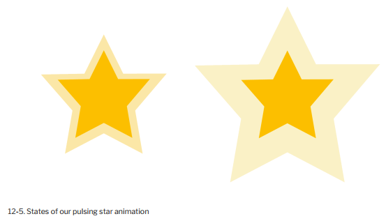
Here we’ve used the SVG-specific property fiLL-opacity . As with CSS, if we can interpolate the value of an SVG styling property, we can animate or transition it. You can see two different points of the animation in the image below.
Let’s look at another example. This time we’ll create a drawing effect by transitioning the stroke-dasharray property. Here’s our SVG document:
<svg version=”1.1″ xmlns=”http://www.w3.org/2000/svg”
xmlns:xlink=”http://www.w3.org/1999/xlink” x=”0px” y=”0px”
viewBox=”0 0 200 200″ enable-background=”new 0 0 200 200″>
<circle fill=”transparent” stroke-width=”16″ cx=”101.3″ cy=”96.8″ r=”79.6″/>
</svg>
The stroke-dasharray property accepts a comma-separated list of length or percentage values that create a dashed pattern. Odd-numbered values determine the dash length. Even- numbered values determine the gap length. A stroke-dasharray value of 5, 10 means that the stroke will be 5px long with a gap of i0px between each dash. A value of 5, 5, 10 alternates 5px and 10px dash lengths with 5px gaps in between.
We can use stroke-dasharray to create a drawing effect by starting with a zero dash length and a large gap, and ending with a large dash length and a dash gap of zero. Then we’ll transition between the two. Here’s what our CSS looks like:
circle {
transition: stroke-dasharray 1s ease-in;
fill: transparent;
stroke-dasharray: 0, 500;
}
.animate {
stroke-dasharray: 500, 0;
}
At the beginning of the transition, our stroke is invisible because the dash length is 0 and our gap is 500 . But when we add the animate class to our circle, we shift the dash length to 500 and eliminate the gap. The effect is a bit like drawing a circle with a pair of compasses. Why 500? It’s the smallest value that worked to create this particular effect.
1. An Animated Path Future
Remember our example of defining a path via CSS from the previous section? Someday, we may be able to animate paths in every browser, using CSS:
path {
d: path(“M357.5 451L506.889 192.25H208.111L357.5 451Z”);
transition: d 1s ease-in-out;
}
.straighten {
d: path(“M357.5 8871L406 -10113.75H208.111L357.5 351Z”);
}
To date, however, only Chromium-based browsers such as Google Chrome and Microsoft Edge support animating path definitions in this way. To make this work in other browsers, use a JavaScript library such as GreenSock and its MorphSVGPlugin. In addition to its crossbrowser compatibility, GreenSock and the MorphSVGPlugin also make it much easier to morph between two shapes regardless of the number of points in each.
Source: Brown Tiffany B (2021), CSS , SitePoint; 3rd edition.