Bootstrap’s grid system is arguably its most impressive and most commonly used feature, as it solves the important task of horizontal and vertical positioning of a page’s contents, allowing the contents to be structured across multiple display widths. Therefore, mastering this core functionality is essential for any Bootstrap developer.
As already noted in chapter 1, Revving Up Bootstrap, Bootstrap 4 is mobile-first. As such, it should come as no surprise that the grid system is optimized for smaller viewports, and it scales up to suit larger viewports (as opposed to scaling down to smaller viewports).
The grid composing the grid system is a structure that consists of three distinct, but fundamentally linked, parts: an all—encapsulating container split into horizontal rows that are themselves split into 12 equal columns (refer to Figure 2.1). In the following subsections, we will take an in-depth look at the three building blocks of Bootstrap’s grid system:
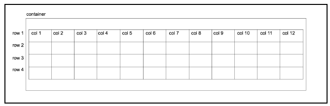
Figure 2.1: The Bootstrap grid structure: a container (outermost box) containing a table-like structure consisting of rows and 12 columns. It is important to note that rows must be
contained inside the container. Likewise, columns can only exist within the context of rows. While grids can be used to construct tables, they are not tables in themselves. Unlike tables, independent rows may consist of a different number of columns. So, for example, row 1 may consist of 12 columns, while row 2 may contain only three columns.
1. Containers
Containers are at the core of Bootstrap’s grid system, and they typically form the root of all Bootstrap pages. A container is exactly what it sounds like—an element for holding all other content within a section of a page. By remaining toward the top of the element hierarchy, a container provides the base for how the section contained within it is rendered. You can think of a container as representing a canvas in a browser window for your content. All this content will be displayed on this canvas, which in turn can transform based on its environment. Unless explicitly specified, your content will never creep outside of this canvas, regardless of the viewport. A container can apply to the entire contents of a page, where you would have one root container element, or to different sections of a page, where you would have numerous container elements on the page.
There are two types of container classes provided by Bootstrap: container and container-fluid.
2. Container
The container class renders the contents of the page to a fixed width. This width is typically based upon the width of the viewport, leveraging CSS media queries to determine which width is most suitable. These media queries are expressions that resolve to a boolean (true or false) value. By using these queries, one can apply different style rules—known as media rules—based on different viewport properties. In the case of the grid system, Bootstrap uses these media queries and the viewport’s width to determine the fixed width to apply to a container’s content. In order to achieve this adjustment of width, the media rules triggered by the media queries work in conjunction with breakpoints. Breakpoints in relation to web development layouts are predefined vertical and horizontal dimensions at which the style rules change. As these rules break, they trigger another set of rules optimized for those dimensions. These rules are triggered by media queries, querying the dimensions of the viewport. For example, @media (min-width: 7 68px) will trigger a set of rules when the viewport is more than 768 px wide.
The grid system has five such core breakpoints:
- extra-small (xs): Typically refers to the extra small screens encountered on mobile devices (for example, portrait mobile phone screens)
- small (sm): Refers to your average mobile device screen (for example, landscape mobile phone screens)
- medium (md): Refers to medium screen sizes, such as those encountered with tablets
- large (lg): Refers to large screens, such as those encountered on laptop devices and desktops
- extra-large (xl): Refers to extra-large screens, such as those on wide-screen desktop monitors
The breakpoints are defined in _variables.scss:
$grid-breakpoints: (
xs: 0,
sm: 576px,
md: 768px,
lg: 992px,
xl: 1200px
) !default;
In other words, inside _variables.scss, Bootstrap is defining the five breakpoints’ width variables. Bootstrap will reference these variables throughout its Sass code, and the breakpoints can now be accessed as properties of $grid-breakpoints.
Inside _variables.scss, we can also see the variables for the various container sizes associated with the appropriate breakpoints. Consider the given example:
// Grid containers //
// Define the maximum width of ‘.container’ for different screen sizes. $container-max-widths: (
sm: 540px,
md: 720px,
lg: 960px,
xl: 1140px
) !default;
@include _assert-ascending($container-max-widths, “$container-max-widths”);
// Grid columns
//
// Set the number of columns and specify the width of the gutters.
$grid-columns: 12 !default;
$grid-gutter-width: 30px !default;
For example, container-max-widths is set to 750 px: 720 px plus the value of grid-gutter- width, which is 30 px. These sizes are leveraged via media queries in _grid.scss to set the desired width of the container. Let’s take a look inside _grid.scss at the .container class:
.container {
@include make-container();
@include make-container-max-widths();
}
The preceding make-container() and make-container-max-widths() are mixins with rules to center the container within the viewport and set max-width rules, respectively.
You will also find make-container and make-container-max-widths within _grid.scss. The make-container mixin centralizes the alignment of the container using margin and padding rules. Take a look at the following code:
@mixin make-container() {
width: 100%;
padding-right: ($grid-gutter-width / 2);
padding-left: ($grid-gutter-width / 2);
margin-right: auto; margin-left: auto;
}
Media queries as Sass mixins?
All Bootstrap media queries are available as Sass mixins, allowing you to reuse them at will:
@include media-breakpoint-only(sm) { … }
@include media-breakpoint-only(md) { … }
@include media-breakpoint-only(lg) { … }
@include media-breakpoint-only(xl) { … }
The make-container-max-widths mixin is more complex. It loops through the global $breakpoint variable, synonymous with $grid-breakpoints, and sets a max-width rule for each breakpoint using media queries. Take a look at the following code:
// For each breakpoint, define the maximum width of the container in a media query
@mixin make-container-max-widths($max-widths: $container-max-widths, $breakpoints: $grid-breakpoints) {
@each $breakpoint, $container-max-width in $max-widths {
@include media-breakpoint-up($breakpoint, $breakpoints) {
max-width: $container-max-width;
}
}
}
The completed code then looks like the following:
@media (min-width: 576px) {
.container {
max-width: 540px;
}
}
@media (min-width: 768px) {
.container {
max-width: 720px;
}
}
@media (min-width: 992px) {
.container {
max-width: 960px;
}
}
@media (min-width: 1200px) {
.container {
max-width: 1140px;
}
}
There are four media queries defining the horizontal breakpoint to trigger a width style rule. For example, @media (min-width: 7 68px) instructs the browser to only set the width property to the max-width of the container to 720 px for viewports wider than or equal to 768 px. This property is then superseded by the @media (min-width: 992px) rule when the viewport is wider than or equal to 992 px.
In a vast majority of cases, the width of the contents of the page is fixed to the width of the container. There are cases where the width of the container is ignored. One such case is Bootstrap’s navbar class, in which the navbar element is allowed to fill the entire horizontal width of the viewport. We will come across this scenario in a later chapter.
Now that we have seen how the container is constructed and the theory behind the container, let’s see it in practice. A container is generally a div with a container class in the body of the markup wrapping around the page’s main content. Consider this example:
<body>
<div class=”container”>
<h1>Help, I’m trapped in a container!</h1>
</div>
<div>
<h1>I’m free!</h1>
</div>
</body>
Take a look at Figure 2.2 here:
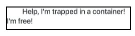
Figure 2.2: Using the container class (example01.html)
3. Container-fluid
Earlier on in this chapter, we noted that there exist two types of containers. In the previous subsection, we covered the first type—container. The second type of container, container-fluid, differs from container in two distinct ways:
- It takes up the full width of the viewport, except for 15 pixels padding left and right
- It doesn’t concern itself with breakpoints
The container-fluid allows the page to be fully responsive to all widths, providing smoother transitions. When responding to breakpoints, container snaps the layout to the appropriate width, while container-fluid progressively alters the layout.
The only difference in the markup is that instead of applying the container class to the container div, the container-fluid class is applied instead. Consider the following code snippet:
<body>
<div class=”container-fluid”>
<h1>Help, I’m trapped in a container!</h1>
</div>
<div>
<h1>I’m free!</h1>
</div>
</body>
The preceding snippet produces the result illustrated in figure 2.3:
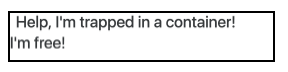
Figure 2.3: Using the container-fluid class (example02.html)
Note that the container element now sits 15 pixels from the edge of the browser. When we use container, the container already has a hard-coded width defined. This width is based on the viewport. For example, at a resolution of 1200 px wide, the container will be 1140 px wide. At a resolution of 1280 pixels, the container will remain at 1170 px wide, because the container only responds to certain breakpoints. When we use container-fluid, the container width is dynamic, because container-fluid responds to every horizontal change and bases the width solely on the padding values from the make-container mixin; container, on the other hand, responds only at specific widths; container-fluid is the approach to take when building a page that needs to work across all display sizes and forms, especially when building mobile-first applications.
The container ensures that our contents will always display within a defined area on the page. But what about positioning content within the container? This is where rows come into play.
Box-sizing
In CSS, every element is represented as a rectangle or box. Each box has a number of properties associated with it to define how the element is rendered. This is the CSS Box Model. The box-sizing property of an element defines how the Box Model should calculate the width and height of elements.
The default value for box-sizing in the CSS box model is content-box. The content-box property only includes the content of an element when calculating the size of that element.
Bootstrap 4 defaults the value of box-sizing to the border-box. The border- box property includes the padding and border as well as the content of the element in the calculation of the height and width of the element. Note that the margin is not included in the calculation. The third possible value for box-sizing is padding-box. The padding-box property, as the name suggests, only uses the content and the padding in calculating the size of an element.
Source: Jakobus Benjamin, Marah Jason (2018), Mastering Bootstrap 4: Master the latest version of Bootstrap 4 to build highly customized responsive web apps, Packt Publishing; 2nd Revised edition.