1. Rows
A row is used to define a selection of elements that should be dealt with as a horizontal group. As such, rows reside within a container element. The power of the row lies in being able to stack content vertically, almost like containers within a container, or defining a section of the page. Creating a row is as simple as applying the row class to the desired element:
<body>
<div class=”container”>
<h1>Help, I’m trapped in a container!</h1>
<div class=”row”>
<div>Section 1</div>
</div>
<div class=”row”>
<div>Section 2</div>
</div>
<div class=”row”>
<div>Section 3</div>
</div>
</div>
<div>
<h1>I’m free!</h1>
</div>
</body>
Take a look at Figure 2.4, as follows:
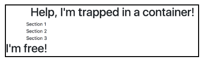
Figure 2.4: Using rows (example03.html)
The true power of rows only becomes apparent when they are used with columns.
2. Columns
Arguably, columns are the most important piece of the grid system. Rows exist within containers, and those rows are split up into 12 equal columns. Before we get into the nitty- gritty details, let’s take a look at an example by taking the first step to create the print sizes section of MyPhoto. There will be 12 print sizes offered. Let’s list those sizes horizontally:
<div class=”container”>
<h1>Our Print Sizes</h1>
<div class=”row”>
<div class=”col-sm-1″>6×5</div>
<div class=”col-sm-1″>8×10</div>
<div class=”col-sm-1″>11×17</div>
<div class=”col-sm-1″>12×18</div>
<div class=”col-sm-1″>16×20</div>
<div class=”col-sm-1″>18×24</div>
<div class=”col-sm-1″>19×27</div>
<div class=”col-sm-1″>20×30</div>
<div class=”col-sm-1″>22×28</div>
<div class=”col-sm-1″>24×36</div>
<div class=”col-sm-1″>27×39</div>
<div class=”col-sm-1″>27×40</div>
</div>
</div>
As usual, we first define our container. Within that container, we created a row, and within that row, we created 12 individual elements with col-sm-1. This produces a very neat list of evenly spaced elements in a single row on the page. take a look at the screenshot in Figure 2.5:
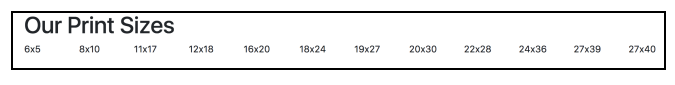
Figure 2.5: Using columns to display print sizes (example04.html)
Let’s break down col-sm-1 and explain each part individually:
- col: This means that we want this element to act as a column
- sm: This is a reference to all viewports above or equal to 576 px. This class means we apply this rule for all viewports equal to or larger than 576 px
- 1: This means that the element takes up one column width of the row (1/12 of the row width)
As col-sm-1 references viewports larger than 576 px, smaller viewports (such as phones) revert to a stacked view. Take a look at the screenshot in Figure 2.6:
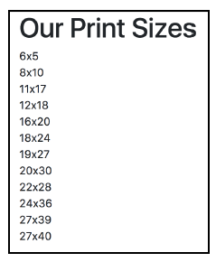
Figure 2.6: Viewports smaller than 544 px revert to a stacked view when using col-sm-1 (example04.html)
Columns are split up into five distinct breakpoints:
- col-: This is for viewports below 576 px (extra-small)
- col-sm-: This is for viewports of 576 px or greater (small)
- col-md-: This is for viewports of 768 px or greater (medium)
- col-lg-: This is for viewports of 992 px or greater (large)
- col-xl-: This is for viewports of 1200 px or greater (extra-large)
The Bootstrap 3 column breakpoints
Bootstrap 3 did not have col-xl. Furthermore, its four distinct breakpoints were as listed:
- col-xs-: This was for viewports below 7 68px (extra-small)
- col-sm-: This was for viewports of 7 68px or greater (small)
- col-md-: This was for viewports of 992px or greater (medium)
- col-lg-: This was for viewports of 1200px or greater (large)
These classes are then appended with the number of columns an element should cover.
Redefining your grid
As previously noted, the number of grid columns as well as the individual breakpoints can be changed globally by modifying the $grid-columns and $grid-breakpoints variables defined in _variables.scss. If modifying the $grid-columns variable, one will also need to update the $grid-gutter-width variable.
As noted in the official Bootstrap 4 documentation, $grid-columns is used to generate the width (in percent) of each individual column, while $grid-gutter-width allows breakpoint-specific widths that are divided evenly across padding-left and padding-right for the column gutters.
(Source: http://getbootstrap.com/docs/4.0/layout/grid/.) Note that we do not advise this, however, as modifying these variables may result in an unintended side.
Now that we understand the column notation, let’s go ahead and split the print sizes into five separate categories, namely, Extra Small, Small, Medium, Large, and Extra Large. As we know, a row is split into 12 columns. We have four print size categories, so we divide the number of columns by the number of elements, and that is the number of columns we want the element to cover. So, we append the number 3 to the col-sm-* class name:
<div class=”container”>
<h1>Our Print Sizes</h1>
<div class=”row”>
<div class=”col-sm-3″>Small</div>
<div class=”col-sm-3″>Medium</div>
<div class=”col-sm-3″>Large</div>
<div class=”col-sm-3″>Extra Large</div>
</div>
</div>
This markup will render the page as shown in the screenshot in figure 2.7:
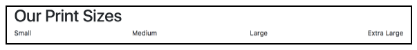
Figure 2.7: Print Categories split it into even columns across the grid system (example05.html)
Again, on an extra-small viewport, we will see the elements stacked, that is, the elements will appear one on top of the other. However, what if we do not want this to happen? What if we would like the elements to take up a different number of columns as the viewport size changes? Well, luckily, Bootstrap allows you to define the column widths for all breakpoints, and it will decide which rule to apply. Let’s try the following:
<div class=”container”>
<h1>Our Print Sizes</h1>
<div class=”row”>
<div class=”col-sm-6 col-md-3″>Small</div>
<div class=”col-sm-6 col-md-3″>Medium</div>
<div class=”col-sm-6 col-md-3″>Large</div>
<div class=”col-sm-6 col-md-3″>Extra Large</div>
</div>
</div>
We have retained col-md-3, but now we have included col-sm-6. This means that for viewports below 768 px in width, we want each element to take up six columns. This will result in the first two elements displaying on one line and the last two below that.
On a viewport 768 px or wider, the categories appear in one horizontal row (as previously suggested, this is a drastic change from Bootstrap 3; with the previous version of Bootstrap, using the code, categories would appear in a horizontal row for viewports of 768 px or wider). Look at the screenshot in Figure 2.8:
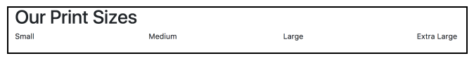
Figure 2.8: The print sizes at a resolution above 768 px (example06.html)
On a viewport of less than 768 px wide, the categories are split across two rows, as shown in figure 2.9:
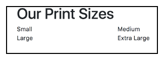
Figure 2.9: The print sizes at a resolution below 768 px (example06.html)
3. Nesting
Not only does the grid system split rows horizontally into columns, it also allows you to split the columns vertically, by supporting nested rows. These nested rows themselves are split into 12 columns within the space provided by the parent column. There is nothing special needed in terms of markup to achieve row inception. All that is needed to achieve this is to nest the elements appropriately and apply the row and column classes.
Let’s organize our print sizes into the relevant categories. We want 12 size options split equally into four size categories. Each category will contain one row element, with each print size taking up one column in the grid. Let’s try the following:
<div class=”container”>
<h1>Our Print Sizes</h1>
<div class=”row”>
<div class=”col-6 col-sm-3″>
<h5>Small</h5>
<div class=”row”>
<div class=”col-sm-4″>6×5</div>
<div class=”col-sm-4″>8×10</div>
<div class=”col-sm-4″>11×17</div>
</div>
</div>
<div class=”col-6 col-sm-3″>
<h5>Medium</h5>
<div class=”row”>
<div class=”col-sm-4″>12×18</div>
<div class=”col-sm-4″>16×20</div>
<div class=”col-sm-4″>18×24</div>
</div>
</div>
<div class=”col-6 col-sm-3″>
<h5>Large</h5>
<div class=”row”>
<div class=”col-sm-4″>19×27</div>
<div class=”col-sm-4″>20×30</div>
<div class=”col-sm-4″>22×28</div>
</div>
</div>
<div class=”col-6 col-sm-3″>
<h5>Extra Large</h5>
<div class=”row”>
<div class=”col-sm-4″>24×36</div>
<div class=”col-sm-4″>27×39</div>
<div class=”col-sm-4″>27×40</div>
</div>
</div>
</div>
</div>
This produces a set of nested print sizes, as illustrated in figure 2.10:
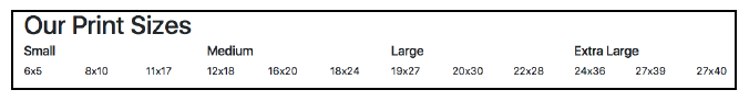
Figure 2.10: The print sizes using nesting (example07.html)
Within our category columns, we have nested a row. We split each row into three equal columns for viewports larger than or equal to 576 px wide, using col-sm-4, to display the print sizes. Typically, it is good practice to ensure that the sum total of columns defined within the nested rows doesn’t exceed the 12 columns allocated, as Bootstrap applies widths based on the assumption of 12 columns. Exceeding the 12 columns may result in unequal or unexpected column widths. However, on some occasions, you may want to force a column onto another line at certain resolutions, where, for example, the text content of columns may slightly overlap at certain resolutions.
In that case, we would like to force certain columns onto another line at a small resolution. To do this, we add col-md-* classes and give the columns requiring a new line at 576 px the col-sm-12 class. Let’s force the third size in the Large category onto its own line and force all Extra Large sizes onto separate lines. Let’s try the following:
<div class=”col-6 col-sm-3″>
<h5>Large</h5>
<div class=”row”>
<div class=”col-sm-12″>19×27</div>
<div class=”col-sm-12″>20×30</div>
<div class=”col-sm-12 col-md-4″>22×28</div>
</div>
</div>
<div class=”col-6 col-sm-3″>
<h5>Extra Large</h5>
<div class=”row”>
<div class=”col-sm-12 col-md-4″>24×36</div>
<div class=”col-sm-12 col-md-4″>27×39</div>
<div class=”col-sm-12 col-md-4″>27×40</div>
</div>
</div>
Take a look at figure 2.11:
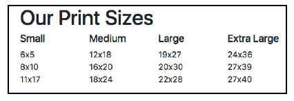
Figure 2.11: The print sizes with the “Extra Large” category forced onto a separate line for viewports equal to or above 576 px (example08.html)
That’s nice and neat. If you have been paying attention, then you will have noted that we do not actually need to define the resolutions below Medium if we want the elements to have separate lines, as this is the default behavior. We will only need to define it if we wanted a resolution below that (such as xs) to have a different behavior. So, this does the trick:
<div class=”col-6 col-sm-3″>
<h5>Large</h5>
<div class=”row”>
<div class=”col-sm-4″>19×27</div>
<div class=”col-sm-4″>20×30</div>
<div class=”col-md-4″>22×28</div>
</div>
</div>
<div class=”col-6 col-sm-3″>
<h5>Extra Large</h5>
<div class=”row”>
<div class=”col-md-4″>24×36</div>
<div class=”col-md-4″>27×39</div>
<div class=”col-md-4″>27×40</div>
</div>
</div>
4. Auto-layout of columns
If you are not concerned about viewport-dependent column sizes, then you can use the non-breakpoint-specific column classes: col-*. Using these classes, you can both set equal- width columns and specify your exact column sizes. Using equal-width columns, our aforementioned nested print sizes example will translate into the following (note the use of the unnumbered col class):
<div class=”col-6 col-sm-3″>
<h5>Extra Large</h5>
<div class=”row”>
<div class=”col”>24×36</div>
<div class=”col”>27×39</div>
<div class=”col”>27×40</div>
</div>
</div>
Since this feature also relies on Flexbox, it is important to note the following observation taken from the Bootstrap 4 documentation:
“Equal-width columns can be broken into multiple lines, but there is a Safari flexbox bug that prevents this from working without an explicit flex-basis or border. Our example works thanks to the border being set; you can do the same with .col {border: 1 px solid transparent;}. Alternatively, you can set the flex-basis to the width of the column (for example, .col {flex: 1 0 50%; }).” (http:// getbootstrap.com/docs/4.0/layout/grid/#flex-order)
Behind the scenes, Bootstrap defines col using 6 simple rules:
.col {
-ms-flex-preferred-size: 0; flex-basis: 0;
-webkit-box-flex: 1;
-ms-flex-positive: 1;
flex-grow: 1;
max-width: 100%;
}
The first two rules basically set the element’s size to 0, hence giving us a clean slate to work with. It should be noted that the second rule—flex-basis—should not be confused with flex-width: the former works along both axes, while the latter only sets the horizontal width of an element. The flex-grow property defines the factor of the amount of space that the element can take up. Last, but not least, Bootstrap explicitly defines the maximum width of the element to be 100%, that is, the element can take up all the available space.
If we do not wish our columns to take on an equal width but wish to specify a viewport size independent width, we simply prepend the col class with a number ranging from 1 to 12 (just as is the case with the viewport-sensitive col classes). Let’s assume that we wish to make the last resolution in our nested column wider than the previous two. In this case, we will replace the col class for the div containing the 27×4 0 text with col-6. To allow us to visualize this change better, we will also change the column’s background color to light blue (refer to figure 2.12):
<div class=”col-6 col-sm-3″>
<h5>Extra Large</h5>
<div class=”row”>
<div class=”col”>24×36</div>
<div class=”col”>27×39</div>
<div class=”col-6″ style=”background: lightblue;”>27×40</div>
</div>
</div>
The col-* classes are defined by Bootstrap using a combination of the flex element’s growth factor property and its maximum width property. For example, col-1 is defined as follows:
.col-1 {
-webkit-box-flex: 0;
-ms-flex: 0 0 8.333333%;
flex: 0 0 8.333333%;
max-width: 8.333333%;
}
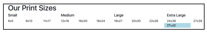
Figure 2.12: Using Bootstrap’s col-* to create viewport size independent columns (example10.html)
Another common use case requiring auto sizing is when one wants to adjust the size of a column based on the column’s content (and not based off of some fixed dimension). For this instance, Bootstrap provides us with the col-*-auto class, where * within this context refers to the breakpoint (sm, md, lg, and xl). Consider this example:
<div class=”col-6 col-sm-3″>
<h5>Extra Large</h5>
<div class=”row”>
<div class=”col”>24×36</div>
<div class=”col”>27×39</div>
<div class=”col-md-auto” style=”background: lightblue;”>Other
dimensions</div>
</div>
</div>
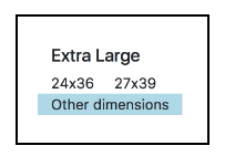
Figure 2.12.1: Using Bootstrap’s col-*-auto to automatically adjust the size of a column based on its content (example10.1.html)
Last, but not least, columns can be forced onto new lines by inserting an element with the w-100 class:
<div class=”col-sm-3″>
<h5>Extra Large</h5>
<div class=”row”>
<div class=”col”>24×36</div>
<div class=”col”>27×39</div>
<div class=”w-100″></div>
<div class=”col”>27×40</div>
</div>
</div>
The w-100 class simply sets the width of the element to 100%, forcing it to take up all the available horizontal space. Bootstrap offers a range of classes at a 25% interval: w-25, w-50, w-75, and w-100. Their vertical equivalents are h-25, h-50, h-75, and h-100.
5. Alignment
The alignment of each row can be customized, irrespective of the alignment of the previous or succeeding rows, that is, using the justify-content-start, justify-content- center, and justify-content-end classes, columns can be left-, right-, and center- aligned. For example, let’s revert to our simple, unnested grid and arrange the grid in such a way that the columns on the first row are center-aligned and align the columns on the second and third row to the right and to the left, respectively. To do so, we simply add the justify-content-start class alongside the row to the first element, and the justify- content-start and justify-content-end classes to the following rows:
<div class=”container”>
<h1>Our Print Sizes</h1>
<div class=”row justify-content-center”>
<div class=”col-sm-6 col-md-3″>Small</div>
<div class=”col-sm-6 col-md-3″>Medium</div>
</div>
<div class=”row justify-content-start”>
<div class=”col-sm-6 col-md-3″>Large</div>
<div class=”col-sm-6 col-md-3″>Extra Large</div>
</div>
<div class=”row justify-content-end”>
<div class=”col-sm-6 col-md-3″>Enormous</div>
<div class=”col-sm-6 col-md-3″>Extra Enormous</div>
</div>
</div>
6. Flex Order
To allow you to manually control the order of your elements, Bootstrap provides you with the order-* classes. Using these classes, one can move columns horizontally along their parent row. For instance, perhaps you wanted the Extra Large category to appear before the Large category in certain resolutions. You would simply dynamically apply a specific instance of the order-* class to the appropriate columns. Take this example into consideration:
<div class=”container”>
<h1>Our Print Sizes</h1>
<div class=”row”>
<div class=”col”>Small</div>
<div class=”col”>Medium</div>
<div class=”col order-md-2″>Large</div>
<div class=”col order-md-1″>Extra Large</div>
</div>
</div>
As with the col-* classes, the ordering classes consist of responsive and non-responsive versions. The non-responsive equivalent of order-*-* is simply order-* (for example, order-1, order-2, order-3, and so on).
It is important to note that the order classes are merely wrappers for the CSS3 order property (the order property simply specifies the order of an element relative to the other elements that share its container). In the case of the responsive order classes, they are simply accompanied by breakpoints. For example, Bootstrap 4 defines order-1 simply as follows:
.order-1 {
-webkit-box-ordinal-group: 2;
-ms-flex-order: 1;
order: 1;
}
7. Offsetting
One neat feature of the grid system is how it allows you to create empty space within your row using columns. If you wanted to list the categories and sizes but, for some reason, you wanted to leave the space for Medium empty, in other grid systems you may need to add the empty elements to the markup to get the desired effect. Consider the given example:
<div class=”container”>
<h1>Our Print Sizes</h1>
<div class=”row”>
<div class=”col-6 col-sm-3″>
<h5>Small</h5>
<div class=”row”>
<div class=”col-sm-4″>6×5</div>
<div class=”col-sm-4″>8×10</div>
<div class=”col-sm-4″>11×17</div>
</div>
</div>
<div class=”col-6 col-sm-3″></div>
<div class=”col-6 col-sm-3″>
<h5>Large</h5>
<div class=”row”>
<div class=”col-sm-4″>19×27</div>
<div class=”col-sm-4″>20×30</div>
<div class=”col-md-4″>22×28</div>
</div>
</div>
<div class=”col-6 col-sm-3″>
<h5>Extra Large</h5>
<div class=”row”>
<div class=”col-md-4″>24×36</div>
<div class=”col-md-4″>27×39</div>
<div class=”col-md-4″>27×40</div>
</div>
</div>
</div>
</div>
Observe the following screenshot:
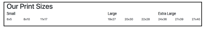
Figure 2.13: Adding spacing between columns (example11.html)
While it has the desired effect, it is adding markup simply for the sake of layout, which isn’t really what we want to do if we can avoid it. Bootstrap allows us to avoid it via the offset classes. The offset classes follow the same convention as the rest of the column classes, offset-*-*. Now, we can remove the empty layout elements and simply add the offset classes to the Large columns. Take a look at the following code:
<div class=”col-6 col-sm-3″>
<h5>Small</h5>
<div class=”row”>
<div class=”col-sm-4″>6×5</div>
<div class=”col-sm-4″>8×10</div>
<div class=”col-sm-4″>11×17</div>
</div>
</div>
<div class=”col-6 col-offset-6 col-sm-3 offset-sm-3″>
<h5>Large</h5>
<div class=”row”>
<div class=”col-sm-4″>19×27</div>
<div class=”col-sm-4″>20×30</div>
<div class=”col-md-4″>22×28</div>
</div>
</div>
<div class=”col-6 col-sm-3″>
<h5>Extra Large</h5>
<div class=”row”>
<div class=”col-md-4″>24×36</div>
<div class=”col-md-4″>27×39</div>
<div class=”col-md-4″>27×40</div>
</div>
</div>
Voila! We have the same result with less code, the goal we all aim to achieve.
With containers, rows, and columns, we can now think about our layout more easily. By splitting a viewport into understandable chunks and concepts, the grid system gives us a structure to apply our content.
Source: Jakobus Benjamin, Marah Jason (2018), Mastering Bootstrap 4: Master the latest version of Bootstrap 4 to build highly customized responsive web apps, Packt Publishing; 2nd Revised edition.