Now that we know what Bootstrap has to offer, let’s set up our project:
- Create a new project directory named MyPhoto. This will become our project root directory.
- Create a blank html file and insert the following HTML code:
<!DOCTYPE html>
<html lang=”en”>
<head>
<meta charset=”utf-8″>
<meta name=”viewport” content=”width=device-width, initial- scale=1, shrink-to-fit=no”>
<meta http-equiv=”x-ua-compatible” content=”ie=edge”>
<title>MyPhoto</title>
</head>
<body>
<div class=”alert alert-success”> Hello World!
</div>
</body>
</html>
Note the three meta tags. The first tag tells the browser that the document in question is utf-8 encoded. Since Bootstrap optimizes its content for mobile devices, the subsequent meta tag is required to help with viewport scaling. The last meta tag forces the document to be rendered using the latest document rendering mode available if viewed in Internet Explorer.
- Open index.html in your browser. You should see just a blank page with the words Hello World.
Now it is time to include Bootstrap. At its core, Bootstrap is a glorified CSS style sheet. Within that style sheet, Bootstrap exposes very powerful features of CSS with an easy-to-use syntax. It being a style sheet, you include it in your project as you would with any other style sheet that you might develop yourself—that is, open the index.html and directly link it to the style sheet.
1. Viewport scaling
The term “viewport” refers to the available display size to render the contents of a page. The viewport meta tag allows you to define this available size. Viewport scaling using meta tags was first introduced by Apple and, at the time of writing, is supported by all major browsers.
Using the width parameter, we can define the exact width of the user’s viewport. For example, <meta name=”viewport” content=”width=320″> will instruct the browser to set the viewport’s width to 320px. The ability to control the viewport’s width is useful when developing mobile-friendly websites; by default, mobile browsers will attempt to fit the entire page onto their viewports by zooming out as far as possible. This allows users to view and interact with websites that have not been designed to be viewed on mobile devices. However, as Bootstrap embraces a mobile-first design philosophy, a zoom out will, in fact, result in undesired side effects. For example, breakpoints (which we will discuss in chapter 2, Making a Style Statement) will no longer work as intended, as they now deal with the zoomed-out equivalent of the page in question. This is why explicitly setting the viewport width is so important. By writing content=”width=device-width, initial-scale=1, shrink-to-fit=no”, we are telling the browser the following:
- We want to set the viewport’s width to be equal to the actual device’s screen width
- We do not want any zoom initially
- We do not wish to shrink the content to fit the viewport
For now, we will use the Bootstrap builds hosted on Bootstrap’s official Content Delivery Network (CDN). This is done by including the following HTML tag into the head of your HTML document (the head of your HTML document refers to the contents between the <head> opening tag and the </head> closing tag):
<link rel=”stylesheet”
href=”https://maxcdn.bootstrapcdn.com/bootstrap/4.0.0/css/bootstrap.min.css ” >
Bootstrap relies on jQuery, a JavaScript framework that provides a layer of abstraction in an effort to simplify the most common JavaScript operations (such as element selection and event handling). If you just need Bootstrap for laying out your app, you don’t need to include those JS files. The Bootstrap JavaScript files are only needed if you’ll use any of these components:
- Alerts
- Buttons
- Carousels
- Collapsible content
- Dropdowns
- Navbar
- Tooltips
- Scrollspy
Since we will be making use of all the aforementioned components, we must include the Bootstrap JavaScript file, and we must first include jQuery. Both inclusions should occur just before the </body> closing tag.
Let’s add the following to our HTML document:
<script src=”https://code.jquery.com/jquery-3.2.1.slim.min.js”></script>
<script
src=”https://cdnjs.cloudflare.com/ajax/libs/popper.js/1.12.9/umd/popper.min
.js”></script>
<script
src=”https://maxcdn.bootstrapcdn.com/bootstrap/4.0.0/js/bootstrap.min.js”><
/script>
Note that while these scripts could, of course, be loaded at the top of the page, loading scripts at the end of the document is considered the best practice to speed up page loading time and to avoid JavaScript issues preventing the page from being rendered. The reason for this is that browsers do not download all dependencies in parallel (although a certain number of requests are made asynchronously, depending on the browser and the domain). Consequently, forcing the browser to download dependencies early on will block page rendering until these assets have been downloaded. Furthermore, ensuring that your scripts are loaded last will ensure that once you invoke Document Object Model (DOM) operations in your scripts, you can be sure that your page’s elements have already been rendered. As a result, you can avoid checks that ensure the existence of given elements.
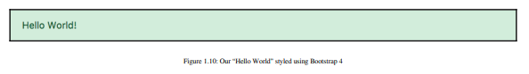
Save your changes and reload the index.html in your browser. The Hello World string should now contain a green background:
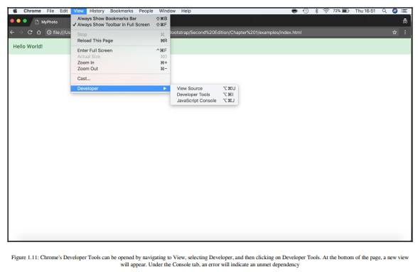
Now that the Bootstrap framework has been included in our project, open your browser’s developer console (if using Chrome on Microsoft Windows, press Ctrl + Shift + I; on macOS X, you can press cmd + Alt + I). As Bootstrap requires another third-party library Popper, for displaying popovers and tooltips, the developer console will display an error (Figure 1.6). Take a look at the following screenshot:
Popper is available via the CloudFare CDN and consists of both a CSS file and a JavaScript file. The dependency is a library that allows for the easy positioning of tooltips and popovers and is approximately 6 KB in size. It should be noted that the required version for Bootstrap is 1.12.9, although Bootstrap will function correctly—except for its tooltips and popovers—if the library, or an incorrect version of the library, is being included:
<!DOCTYPE html>
<html lang=”en”>
<head>
<meta charset=”utf-8″>
<meta name=”viewport” content=”width=device-width, initial- scaled, shrink-to-fit=no”>
<meta http-equiv=”x-ua-compatible” content=”ie=edge”>
<title>MyPhoto</title>
<link rel=”stylesheet” href=”https://maxcdn.bootstrapcdn.com/
bootstrap/4.0.0/css/bootstrap.min.css” >
</head>
<body>
<div class=”alert alert-success”>
Hello World!
</div>
<script src=”https://code.jquery.com/jquery-3.2.1.slim.min.js”> </script>
<script src=”https://cdnjs.cloudflare.com/ajax/libs/popper.js/
1.12.9/umd/popper.min.js”></script>
<script src=”https://maxcdn.bootstrapcdn.com/bootstrap/4.0.0/js/ bootstrap.min.js”></script>
</body>
</html>
While CDNs are an important resource, there are several reasons why, at times, using a third-party CDN may not be desirable:
- CDNs introduce an additional point of failure, as you now rely on third-party servers.
- The privacy and security of users may be compromised, as there is no guarantee that the CDN provider does not inject malicious code into the libraries that are being hosted, nor can one be certain that the CDN does not attempt to track its users.
- Certain CDNs may be blocked by the Internet Service Providers of users in different geographical locations.
- Offline development will not be possible when relying on a remote CDN.
- You will not be able to optimize the files hosted by your CDN. This loss of control may affect your website’s performance (although typically, you are more often than not offered an optimized version of the library through the CDN).
Instead of relying on a CDN, we can manually download the jQuery, Popper, and Bootstrap project files. We can then copy these builds into our project root and link them to the distribution files. The disadvantage of this approach is the fact that maintaining a manual collection of dependencies can quickly become very cumbersome and next to impossible as your website grows in size and complexity.
As such, we will not manually download the Bootstrap build. Instead, we will let NPM do it for us. NPM is a package management system—that is, a tool that you can use to manage your website’s dependencies. It automatically downloads, organizes, and (upon command) updates your website’s dependencies. To install Bower, head over to https://www.npmjs.com/get-npm.
Once NPM has been installed, open up your terminal, navigate to the project root folder you created earlier, and fetch the Bootstrap build:
npm init
npm install bootstrap
This will create a new folder structure in our project root:
| node_modules
| bootstrap
| LICENSE
| README.md
| package.json
| dist
| js
| scss
We will explain all of these various files and directories later on in this book. For now, you can safely ignore everything except for the dist directory inside
node_modules/bootstrap/. Go ahead and open the dist directory. You should see three subdirectories:
- css
- js
The name dist stands for distribution. Typically, the distribution directory contains the production-ready code that users can deploy. As its name implies, the css directory inside dist includes the ready-for-use style sheets. Likewise, the js directory contains the JavaScript files that compose Bootstrap.
To reference the local Bootstrap CSS file in our index.html, modify the href attribute of the link tag that points to bootstrap.min.css:
<link rel=”stylesheet” href=”node_modules/bootstrap/dist/css /bootstrap.min.css”>
Let’s do the same for the Bootstrap JavaScript file:
<script src=”node_modules/bootstrap/dist/js/bootstrap.min.js”></script>
Repeat this process for both jQuery and Popper. To install jQuery using Bower, use the following command:
npm install jquery@>=3.0.0
Just as before, a new directory will be created inside the node_modules directory:
| node_modules
| jquery
| AUTHORS.txt
| LICENSE.txt
| README.md
| bower.json
| dist
| external
| package.json
| src
Again, we are only interested in the contents of the dist directory, which, among other files, will contain the compressed jQuery build jquery.min.js.
Reference this file by modifying the src attribute of the script tag that currently points to Google’s jquery.min.js by replacing the URL with the path to our local copy of jQuery:
<script src=”node_modules/jquery/dist/jquery.min.js”></script>
Last but not least, repeat the steps already outlined for Popper:
npm install popper.js@^1.12.9
Once the installation completes, a similar folder structure to the ones for Bootstrap and jQuery will have been created. Verify the contents of node_modules/popper.js/dist and replace the CDN Popper references in our index.html with their local equivalent. The final index.html should now look as follows:
<!DOCTYPE html>
<html lang=”en”>
<head>
<meta charset=”utf-8″>
<meta name=”viewport” content=”width=device-width,
initial- scale=1, shrink-to-fit=no”>
<meta http-equiv=”x-ua-compatible” content=”ie=edge”> <title>MyPhoto</title>
<link rel=”stylesheet”
href=”node_modules/bootstrap/dist/css/bootstrap.min.css”>
</head>
<body>
<div class=”alert alert-success”>
Hello World!
</div>
<script src=”node_modules/jquery/dist/jquery.min.js”></script>
<script src=”node_modules/popper.js/dist/umd/popper.min.js”> </script>
<script src=”node_modules/bootstrap/dist/js/bootstrap.min.js”> </script>
</body>
</html>
Refresh the index.html in your browser to ensure that everything works.
Source: Jakobus Benjamin, Marah Jason (2018), Mastering Bootstrap 4: Master the latest version of Bootstrap 4 to build highly customized responsive web apps, Packt Publishing; 2nd Revised edition.