Much has changed since Twitter’s Bootstrap was first released on August 19th, 2011. In essence, the first version of Bootstrap was a collection of CSS rules offering developers the ability to lay out their website, create forms, buttons, and help with general appearance and site navigation. With respect to these core features, Bootstrap 4 is still much the same as its predecessors—that is, how one uses the framework to create layouts and user interfaces with a consistent appearance. The latter is achieved by applying Bootstrap styles to buttons, forms, and other user interface elements.
While the elementary features of Bootstrap have remained the same, under the hood, the framework has changed completely, as Bootstrap 4 has been rewritten from scratch. As such, the framework introduces new utility classes and new components, and drops support for others at the same time. The appearance of individual components has changed too, and so has the manner in which third-party plugins should be defined and created. The developers of Bootstrap 4 have also stopped support for some older web-browsers and added support for others – namely, Android v5.0 Lollipop’s Browser and WebView. Along with Bootstrap’s major features, we will be discussing these changes in the subsections that follow.
1. Layout
Possibly the most important and widely used feature is Bootstrap’s ability to lay out and organize a page. At the core of this functionality lies the Bootstrap grid system: a series of CSS classes and media queries that allow you to easily define the horizontal and vertical position of elements on a page, taking into account different screen sizes at the same time. Using the grid system is as easy as applying a few classes to your elements and specifying a tier (that is, the viewport size at which the sizing for the element takes effect). No JavaScript magic or custom CSS rules need to be written. With Bootstrap 4, this grid system has been completely overhauled, and a new grid tier has been added. This means that in contrast to Bootstrap 3, the grid system now offers tiers for extra-small, small, medium, large, and extra-large displays. We will be talking about tiers, breakpoints, and Bootstrap’s grid system extensively in chapter 2, Making a Style Statement.
Along with the grid system, Bootstrap offers the following:
- Responsive containers.
- Responsive breakpoints for adjusting page layout in response to differing screen sizes.
- Media objects that act as building blocks and allow you to build your own structural components.
- Utility classes that allow you to manipulate elements in a responsive manner. For example, you can use the layout utility classes to hide elements, depending on screen size.
Also, Bootstrap 4 now ships with default support for a CSS3 layout mode called flexbox, for the easier positioning of elements while also accounting for different screen sizes. We will be talking about how to manage element alignment using flexbox later on in Chapter 8, Utilities.
2. Content styling
As already noted, one of Bootstrap’s core objectives is to allow the development of consistent user interfaces. This means that using Bootstrap, one should be able to build web pages that look and feel the same, regardless of which browser is being used to view them. Alternatively, in other words, and as noted in the official Bootstrap 4 documentation:
“part of Bootstrap’s job is to provide an elegant, consistent, and simple baseline to build upon.”
As different browsers ship with different element styles, Bootstrap overrides all the default browser styles, hence ensuring the consistent rendering of elements across different browsers. The overriding is achieved using a collection of Bootstrap CSS rules collectively known as Reboot. These rules are the Bootstrap team’s own modification of Normalize—a third-party library (used by Bootstrap 3) for resetting default element styles.
Building on top of this clean slate, Bootstrap 4 provides a set of basic styles that allow you to effectively improve the general look and feel of the most commonly-used elements used to construct user interfaces. Examples of the elements that Bootstrap allows you to style are buttons (figure 1.2), input fields, headings (figure 1.3), paragraphs, special inline texts, figures, tables, and navigation controls.
 In addition, Bootstrap offers state styles for all input controls—for example, styles for disabled buttons or toggle buttons:
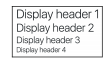 Figure 1.3: Bootstrap’s typography styles. In the above example, we see styling for different display headers
It should be noted that the default font size in Bootstrap 4 is now 2 px bigger than in its predecessor, having increased from 14 px to 16 px. Naturally, this makes textual content, such as body text and headings, appear slightly larger without being too obtrusive. The display of text is now also controlled by your native font stack (also known as the system font stack; the native font stack refers to the default collection of fonts used by your operating system) as opposed to the default web fonts. Using the native font stack has the following advantages:
- Improved overall rendering speed of text as the web browser no longer needs to download any font files
- Allows for a more consistent look and feel as a page’s text content matches that of the operating system the browser is running on
3. Components
Bootstrap offers a large collection of fundamental user interface (UI) components that allow you to quickly construct any type of user interface. Specifically, Bootstrap offers Modal dialogs, progress bars, navigation bars, tooltips, popovers, a carousel, alerts, drop-down menus, input groups, tabs, pagination, cards, forms, list groups, breadcrumbs, and a jumbotron (refer to figure 1.4). All of these components, in addition to collapsible content—such as accordions—come out of the box and ready to use.
In addition, they can be styled using one of four context colors introduced in the previous subsection or customized to suit specific needs.
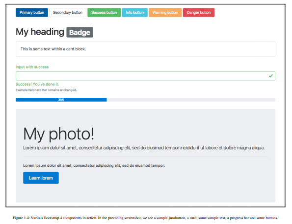
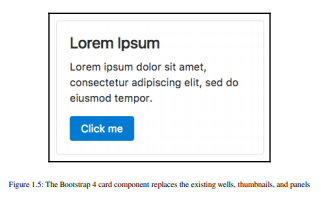
Readers familiar with Bootstrap 3 will have noted that panels, wells, and thumbnails do not feature in the preceding screenshot, figure 1.4. That is because these components have been replaced with a new concept—cards. To readers unfamiliar with the concept of wells, a well is a UI component that allows developers to highlight text content by applying an inset shadow effect to the element to which it is applied. A panel, on the other hand, also serves to highlight information, but by applying padding and rounded borders. Neither panels nor wells, however, took into account different types of contents.
Cards address this shortcoming by being less restrictive and giving the developer the flexibility to support different types of content, such as images, lists, or text, and allowing for the adding of footers and headers; look at figure 1.5:
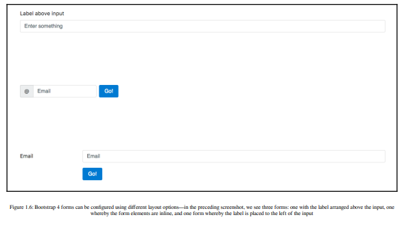
Forms in Bootstrap 4 have also been overhauled and now offered for the configuration of different layout options (refer to Figure 1.6) as well as shipping with input validation classes (check out Figure 1.7):
By applying these classes, the developer can quickly indicate erroneous input or inform the user of the successful submission of the form; doing so in the past required the use of third- party libraries or a manual implementation. Individual form controls – such as buttons – can now also be adjusted in size – a feature that seems trivial, but is often widely required:

The form controls can also be themselves customized while maintaining cross-browser consistency across input elements by applying the custom-* classes (refer to figure 1.7). In essence, these classes allow one to replace the default checkbox, radio, select and file upload input controls (check out figure 1.8, as follows) while maintaining a consistent look:

4. Mobile support
Similar to its predecessor, Bootstrap 4 allows you to create mobile-friendly websites without too much additional development work. By default, Bootstrap is designed to work across all resolutions and screen sizes, from mobile to tablet to a desktop. In fact, Bootstrap’s mobile- first design philosophy implies that its components must display and function correctly at the smallest screen size possible. The reasoning behind this is simple. Think about developing a website without consideration for small mobile screens. In this case, you are likely to pack your website full of buttons, labels, and tables. You will probably only discover any usability issues when a user attempts to visit your website using a mobile device, only to find a small web page that is crowded with buttons and forms. At this stage, you will be required to rework the entire user interface to allow it to render on smaller screens. For precisely this reason, Bootstrap promotes a bottom-up approach, forcing developers to get the user interface to render correctly on the smallest possible screen size, before expanding upward.
5. Utility classes
Apart from ready-to-go components, Bootstrap offers a large selection of utility classes that encapsulate the most commonly needed functionality in order to reduce the number of repetitive style rules. Examples of such utilities include classes for quickly styling borders, clearing floats, creating generic close icons, defining colors, changing the display and visibility properties of elements, and adjusting size and spacing. Some of these utility classes already existed in Bootstrap 3, while others are brand new or have been adapted, renamed, or modified. We will be using these utility classes throughout the course of this book, and they will gain our full, undivided attention in Chapter 8, Utilities, for example, rules for aligning text, hiding an element, or providing contextual colors for warning text.
6. Supported browsers
Bootstrap 4 supports the latest stable release of all modern browsers on both desktop and mobile devices, that is, Firefox, Chrome, Opera, Safari, Internet Explorer 10 – 11, and Microsoft Edge. Furthermore:
“Alternative browsers which use the latest version of WebKit, Blink, or Gecko, whether directly or via the platform’s web view API, are not explicitly supported. However, Bootstrap should (in most cases) display and function correctly in these browsers as well.
More specific support information is provided below.”
(source: official Bootstrap 4 documentation)
It is important to note that unlike its predecessor, Bootstrap 4 no longer supports Internet Explorer 9 and earlier versions. The decision to only support newer versions of Internet Explorer was a reasonable one, as Microsoft itself doesn’t provide technical support and updates for Internet Explorer 8 (and earlier versions) anymore (as of January 2016). Furthermore, as we will discover later on in this book, Bootstrap 4 relies on flexbox, which is also not supported by older browsers.
Furthermore, Internet Explorer 8 (and earlier) does not support rem, meaning that Bootstrap 4 would have been required to provide a workaround. This, in turn, would most likely have implied a large amount of additional development work, with the potential for inconsistencies. Lastly, responsive website development for Internet Explorer 8 (and earlier) is difficult, as the browser does not support CSS media queries. Given these three factors, dropping support for this version of Internet Explorer was the most sensible path of action.
7. Sass instead of Less
Both Less and Sass (Syntactically Awesome Stylesheets) are CSS extension languages—that is, they are languages that extend the CSS vocabulary with the objective of making the development of many, large, and complex stylesheets easier. Although Less and Sass are fundamentally different languages, the general manner in which they extend CSS is the same—both rely on a preprocessor. As you produce your build, the preprocessor is run, parsing the Less/Sass script and turning your Less or Sass instructions into plain CSS.
Less is the official Bootstrap 3 build, while Bootstrap 4 has been developed from scratch, and is written entirely in Sass. Both Less and Sass are compiled into CSS to produce bootstrap.css. Along with that, it also produces its minified version—bootstrap.min.css—and map files. It is this CSS file that we will be primarily referencing throughout this book (with the exception of chapter 3, Building the Layout). Consequently, you will not be required to know Sass in order to follow this book. However, we do recommend that you take a 20-minute introductory course on Sass if you are completely new to the language. Rest assured if you already know CSS; you will not need more time than this. The language’s syntax is very close to normal CSS, and its elementary concepts are similar to those contained within any other programming language.
8. From pixel to root em
Unlike its predecessor, Bootstrap 4 no longer uses pixel (px) as its unit of typographic measurement. Instead, it primarily uses root em (rem). The reasoning behind choosing rem is based on a well-known problem with px; websites using px may render incorrectly, or not as originally intended, as users change the size of the browser’s base font. Using a unit of measurement that is relative to the page’s root element helps address this problem, as the root element will be scaled relative to the browser’s base font. In turn, a page will be scaled relative to this root element.
Typographic units of measurement
Simply put, typographic units of measurement determine the size of your font and elements. The most commonly used units of measurement are px and em. The former is an abbreviation for pixel and uses a reference pixel to determine a font’s exact size. This means that for displays of 96 dots per inch (dpi), 1 px will equal an actual pixel on the screen. For higher resolution displays, the reference pixel will result in the px being scaled to match the display’s resolution. For example, specifying a font size of 100 px will mean that the font is exactly 100 pixels in size (on a display with 96 dpi), irrespective of any other element on the page.
EM is a unit of measurement that is relative to the parent of the element to which it is applied. So, for example, if we were to have two nested div elements, the outer element with a font size of 100 px and the inner element with a font size of 2 em, then the inner element’s font size would translate to 200 px (as in this case 1 em = 100 px). The problem with using a unit of measurement that is relative to parent elements is that it increases your code’s complexity, as the nesting of elements makes size calculations more difficult.
The recently introduced rem measurement aims to address both em’s and px’s shortcomings by combining their two strengths; instead of being relative to a parent element, rem is relative to the page’s root element.
9. Vendor prefix mixing
Since Bootstrap 4 relies on a tool called Autoprefixer to automatically add vendor prefixes to CSS rules, the vendor prefix mixins which were marked as deprecated in Bootstrap version 3.2 have now been completely removed. In addition, the following mixins have also been removed (source: Bootstrap 4 documentation—https://getbootstrap. com/docs/4.0/migration/):
animation, animation-delay, animation-direction, animation-duration, animation-fill-mode, animation-iteration-count, animation-name, animationtiming-function, backface-visibility, box-sizing, content-columns, hyphens, opacity, perspective, perspective-origin, rotate, rotateX, rotateY, scale, scaleX, scaleY, skew, transform-origin, transition-delay, transition- duration, transition-property, transition-timing-function, transition- transform, translate, translate3d, and user-select
10. Icons
Bootstrap 3 shipped with Glyphicons—a nice collection of over 250 font icons, free of use. While great in theory, font icons come with a number of problems in practice:
- Font icons may break screenreaders as the readers will literally try to read out the icon.
- Persons with fonts to aid their reading. Font icons will break if that happens.
- If the icons fail, then the web browser replaces them with a default fallback. This makes controls using these icons look funny at best.
These three major problems, combined with the desire to make Bootstrap 4 more lightweight, led to the development team’s decision to no longer make Glyphicons available (however, this does not prevent one from including font icon set manually).
11. Themes
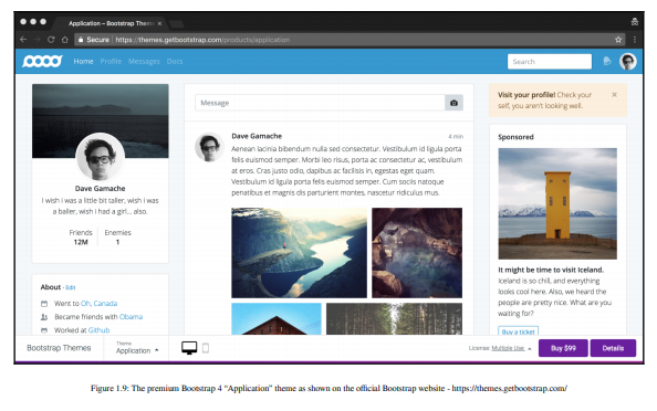
Bootstrap 4 offers a collection of premium themes. At the time of writing, the Bootstrap team offered three distinct themes:
- A Dashboard theme containing premium components aimed toward admin and analytic websites
- A Marketing theme for generic e-commerce and marketing websites
- An Application theme containing components and utilities for building generic web applications (refer to figure 1.9)
Each theme works seamlessly with Bootstrap 4 and ships with all assets included. A multiuse license for these themes costs $99, while an extended license that allows for redistribution and resale costs $999.
12. Customization
The developers behind Bootstrap 4 have put specific emphasis on customization throughout the development of Bootstrap 4. As such, many new variables have been introduced that allow for the easy customization of Bootstrap. Using the $enabled-*- Sass variables (found in node_modules/bootstrap/scss/_variables.scss), one can now enable or disable specific global CSS preferences.
Source: Jakobus Benjamin, Marah Jason (2018), Mastering Bootstrap 4: Master the latest version of Bootstrap 4 to build highly customized responsive web apps, Packt Publishing; 2nd Revised edition.
