Responsive utilities are a group of media query-based classes that control when an element should be hidden or shown depending on the viewport. One popular use case for this is controlling display-specific navigation. For example, a page may have a navigation bar on large displays and a hidden navigation on small displays, which is only displayed when a user chooses to open the navigation.
Let’s look at a quick example with our Print Size page. Add the d-none and d-sm-block classes to the img elements:
<div class=”container”>
<h1>Our Print Sizes</h1>
<div class=”row”>
<div class=”col-sm-3″>
<img src=”images/small.jpg” class=”img-fluid rounded-circle d-none d-sm-block”>
<h5>Small</h5>
…
</div>
<div class=”col-sm-3″>
<img src=”images/medium.jpg” class=”img-fluid rounded d- none d-sm-block”>
<h5>Medium</h5>
…
</div>
<div class=”col-sm-3″>
<img src=”images/large.jpg” class=”img-thumbnail d-none d- sm-block”>
<h5>Large</h5>
…
</div>
<div class=”col-sm-3″>
<img src=”images/extra-large.jpg” class=”img-fluid d-none d-sm-block”>
<h5>Extra Large</h5>
…
</div>
</div>
</div>
The d-done class, as its name implies, sets the display property of the element to which it is applied to none. This makes the element invisible across the board, regardless of the viewport width. On the other hand, the d-sm-block class sets the display property of the element block, making it visible. The combination of these two classes ensures that the element in question becomes visible for small displays and above. This is the equivalent of using the hidden-xs class in Bootstrap 3:
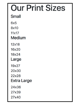
Figure 2.18: Hiding elements based on the viewport size using a combination of the d-sm-block and d-none classes (example16.html)
It should be noted that, once again, Bootstrap offers different variations of these classes, depending on the required breakpoint and property value. For example, d-sm-none, d-md- block, d-sm-block-inline, d-md-inline, and so on.
That is, the d-* classes stick to the conventions found in the grid system. In the grid system, col-md targets all Medium displays and below. Likewise, d-md—none will target only Medium displays or displays smaller than Medium (that is, small).
Source: Jakobus Benjamin, Marah Jason (2018), Mastering Bootstrap 4: Master the latest version of Bootstrap 4 to build highly customized responsive web apps, Packt Publishing; 2nd Revised edition.