The MyPhoto web page will consist of five separate sections: Welcome, Services, Gallery, About, and Contact Us. Each of these sections will form one distinct container. This will allow us to treat each section as a standalone component on the page.
As we want each container to take up 100% of the available horizontal space, we will begin by applying the container-fluid class. As noted in chapter 2, Making a Style Statement, container-fluid allows its contents to be responsive across all resolutions. It achieves this by relying on the percentage width of the page, unlike the standard container class, which uses predefined horizontal breakpoints. To provide a visual cue that these are separate parts of the page, we will apply Bootstrap’s contextual background classes to each section. We will also include a footer element in the page. The footer will contain miscellaneous bits of information, such as links to the site’s terms and conditions. However, for now, we will just include a placeholder:
<body>
<div class=”container-fluid bg-primary”>
<div class=”row”>
<h3>Welcome</h3>
</div>
</div>
<div class=”container-fluid bg-info”>
<div class=”row”>
<h3>Services</h3>
</div>
</div>
<div class=”container-fluid bg-success”>
<div class=”row”>
<h3>Gallery</h3>
</div>
</div>
<div class=”container-fluid bg-warning”>
<div class=”row”>
<h3>About</h3>
</div>
</div>
<div class=”container-fluid bg-danger”>
<div class=”row”>
<h3>Contact Us</h3>
</div>
</div>
<footer>Footer placeholder</footer>
</body>
So, we have five distinct containers, each with a distinct contextual background class and an inner row element, with an appropriate heading along with a footer, producing the page illustrated in Figure 3.1:
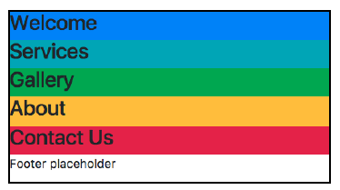
Figure 3.1: Five distinct containers, each with a different contextual background (example01.html)
Now that all of our page’s sections are in place, let’s add some custom CSS to give each section some space to breathe. Create a styles/myphoto.css file and add the following rules to set the minimum height of the section:
.myphoto-section {
min-height: 500px;
}
The myphoto-section class will set the height of the section to a minimum height of 500 px. Add this class to each section, except for the footer:
<div class=”container-fluid myphoto-section bg-primary”>
<div class=”row”>
<h3>Welcome</h3>
</div>
</div>
The addition of the myphoto-section class results in the page illustrated in figure 3.2:
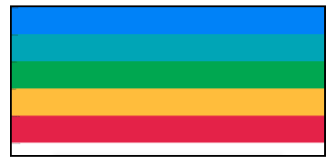
Figure 3.2: Five distinct containers with a minimum height of 500 pixels each (example02.html)
Now each section is easily distinguishable. The page bears a striking resemblance to a rainbow, though, so let’s apply a color scheme to improve its visual appearance. We will apply a classic dark/light style, alternating between dark and light with each section. Update myphoto.css with the following classes:
.bg-myphoto-dark {
background-color: #504747;
color: white;
}
.bg-myphoto-light {
background-color: white;
color: #504747;
}
These new classes adhere to the Bootstrap .bg naming convention and offer contrasting styles, a dark background with light text, and vice versa. Apply these to the container elements in an even-odd manner:
<div class=”container-fluid myphoto-section bg-myphoto-light”>
<div class=”row”>
<h3>Welcome</h3>
</div>
</div>
<div class=”container-fluid myphoto-section bg-myphoto-dark”>
<div class=”row”>
<h3>Services</h3>
</div>
</div>
…
The Welcome section should now appear with a light background, the Services section with a dark background, and so on. Take a look at figure 3.3:
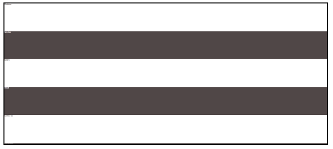
Figure 3.3: Five sections with alternating background colors (example03.html)
Pretty classy, right? Now we have a responsive page split into individual sections, powered by the grid system, with our own styling. Nothing wild here, but a nice start. Let’s go ahead and add some content.
Source: Jakobus Benjamin, Marah Jason (2018), Mastering Bootstrap 4: Master the latest version of Bootstrap 4 to build highly customized responsive web apps, Packt Publishing; 2nd Revised edition.