MyPhoto offers a trio of services. We built the UI for one of these: the Print service, in chapter 2, Making a Style Statement. The UI displayed the prices for various print sizes. Obviously, we will want to integrate the Print service into the Services section of the MyPhoto page. We also need to include the other two services, namely, Events, where a photographer may take photographs of a customer’s event such as a wedding or a conference, and Personal, where a photographer may take family photos and so on.
Rather than building the services into three separate pages, we will develop them using Bootstrap’s tabs component.
Tabs are a part of Bootstrap’s nav family of components. Tabs provide an elegant way of displaying and grouping related content. Under the surface, tabs are simply list elements linked to div elements, representing the tab contents, with some nice styling applied. Tabs are one of the Bootstrap components that require jQuery and bootstrap.js to function correctly.
First, we will add the tab list to the Services section (that is, below <div class=”row”><h3>Services</h3></div>):
ormatted HTML:
<ul class=”nav nav-tabs nav-justified”>
<li class=”nav-item”>
<a href=”#services-events” data-toggle=”tab” class=”nav-link active”>Events </a>
</li>
<li class=”nav-item”>
<a href=”#services-personal” data-toggle=”tab” class=”nav- link”>Personal</a>
</li>
<li class=”nav-item”>
<a href=”#services-prints” data-toggle=”tab” class=”nav-link”>
Prints
</a>
</li>
</ul>
We’re wrapping the Services header in a container element, so we follow the same convention as the Welcome section and leave gutter space around the content. Within that container, we also include the tabs. We create an unordered list (ul) element with the nav base class and the nav-tabs class to apply the tab styling. The list elements are then created, with the tab heading text and an href to the relevant tab content. The nav-item class is applied to each list item to denote that the item is indeed a navigation item (the nav-item class adjusts the margin and float of the list item and ensures that the list items are not stacked on top of each other, but appear next to one another instead). The anchor element that is used to reference the tab’s corresponding section is given a nav-link class. This nav-link class adjusts the following:
- The anchor’s padding so that it displays nicely as a tab link.
- It removes the default anchor focus and hover text decoration.
- It changes the anchor’s display to inline-block. This has two important effects on the element:
- The browser renders any white space contained within the element.
- The element is placed inline but maintains the properties of a block-level element.
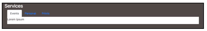
Figure 3.7: Using tabs components to build out the MyPhoto’s Services section (example07.html)
The active class is applied to the default selected list item’s anchor element. Last but not least, the anchor’s data-toggle attribute is set to tab. Our Services section now looks like this:
Navigation tabs in Bootstrap 3
Nav tabs in Bootstrap 3 require slightly more work than when using Bootstrap 4. For one, Bootstrap 3 does not have the nav-item and nav- link classes. Instead, we create an unordered-list (ul) element with the nav base class, namely, nav-tabs class, to apply the tab styling and nav- justified to center the text within the tab headings. The list elements are then created with the tab heading text and an href to the relevant tab content. The active class is applied to the default selected list item:
<ul class=”nav nav-tabs nav-justified” role=”tablist”>
<li role=”presentation” class=”active”>
<a href= “#services-events” role=”tab” data- toggle=”tab”>Events</a>
</li>
<li role=”presentation”>
<a href=”#services-personal” role=”tab” data-toggle=”tab”>Personal</a>
</li>
<li role=”presentation”>
<a href=”#services-prints” role=”tab” data-toggle=”tab”>Prints</a>
</li>
</ul>
Note that the nav-justified class has been removed from Bootstrap 4.
We now have some selectable tabs with inappropriate styling and no content. Let’s resolve the content issue first. We will add Lorem Ipsum text to the Events and Personal tab content, and we will use an Our Print Sizes table for the Prints tab content:
<div class=”tab-content bg-myphoto-light”>
<div role=”tabpanel” class=”tab-pane active” id=”services-events”>
<div class=”container”>
<div class=”row”>
<p>Lorem Ipsum</p>
</div>
</div>
</div>
<div role=”tabpanel” class=”tab-pane” id=”services-personal”>
<div class=”container”>
<div class=”row”>
<p>Lorem Ipsum</p>
</div>
</div>
</div>
<div role=”tabpanel” class=”tab-pane” id=”services-prints”>
<div class=”m-x-auto” style=”width:50%”>
<h1 class=”bg-primary text-center”>Special Offers</h1>
</div>
<div class=”container”>
<h1 class=”hidden-lg-down”>Our Print Sizes</h1>
<div class=”row”>
<div class=”col-sm-3″>
<h5 class=”text-hide”>Small</h5>
<div class=”row”>
<div class=”col-sm-4 bg-info”>
6×5
<div class=”row”>
<div class=”col-sm-3 text-muted”>€15</div>
<div class=”col-sm-3 text-success”>€8</div>
</div>
</div>
<div class=”col-sm-4″>
8×10
<div class=”row”>
<div class=”col-sm-3 text-muted”>€18</div>
<div class=”col-sm-3 text-success”>€11</div>
</div>
</div>
<div class=”col-sm-4″>
11×17
<div class=”row”>
<div class=”col-sm-3 text-muted”>€25</div>
<div class=”col-sm-3 text-success”>€20</div>
</div>
</div>
</div>
</div>
<div class=”col-xs-6 col-sm-3″>
<h5 class=”text-hide”>Medium</h5>
<div class=”row”>
<div class=”col-sm-4″>
12×18
<div class=”row”>
<div class=”col-sm-3 text-muted”>€28</div>
<div class=”col-sm-3 text-success”>€23</div>
</div>
</div>
<div class=”col-sm-4 bg-info”>
16×20
<div class=”row”>
<div class=”col-sm-3 text-muted”>€35</div>
<div class=”col-sm-3 text-success”>€25</div>
</div>
</div>
<div class=”col-sm-4″>
18×24
<div class=”row”>
<div class=”col-sm-3 text-muted”>€40</div>
<div class=”col-sm-3 text-success”>€32</div>
</div>
</div>
</div>
</div>
<div class=”col-sm-3″>
<h5 class=”text-hide”>Large</h5>
<div class=”row”>
<div class=”col-sm-4 bg-info”>
19×27
<div class=”row”>
<div class=”col-sm-3 text-muted”>€45</div>
<div class=”col-sm-3 text-success”>€30</div>
</div>
</div>
<div class=”col-sm-4″>
20×30
<div class=”row”>
<div class=”col-sm-3 text-muted”>€48</div>
<div class=”col-sm-3 text-success”>€40</div>
</div>
</div>
<div class=”col-md-4 bg-info”>
22×28
<div class=”row”>
<div class=”col-sm-3 text-muted”>€55</div>
<div class=”col-sm-3 text-success”>€40</div>
</div>
</div>
</div>
</div>
<div class=”col-sm-3″>
<h5 class=”text-hide”>Extra Large</h5>
<div class=”row”>
<div class=”col-md-4″>
24×36
<div class=”row”>
<div class=”col-sm-3 text-muted”>€60</div>
<div class=”col-sm-3 text-success”>€55</div>
</div>
</div>
<div class=”col-md-4 bg-info”>
27×39
<div class=”row”>
<div class=”col-sm-3 text-muted”>€75</div>
<div class=”col-sm-3 text-success”>€60</div>
</div>
</div>
<div class=”col-md-4 bg-info”>
27×40
<div class=”row”>
<div class=”col-sm-3 text-muted”>€75</div>
<div class=”col-sm-3 text-success”>€60</div>
</div>
</div>
</div>
</div>
</div>
<div class=”bg-danger”>
<p class=”label”>Terms and Conditions Apply</p>
</div>
</div>
</div>
</div>
We add a tab-content element to wrap the three services, which are declared with a tab- pane class. The tab-pane classes have an id attribute matching the href attribute of the corresponding tab heading, and each of the tab-pane elements has a container element for the contents of the pane. Now, clicking on the Prints tab will surface the Our Print Sizes chart. We have modified the print sizes chart for its new context within the tabs component. Take a look at figure 3.8:
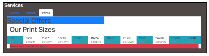
Figure 3.8: Adding tab content using the tab-pane class (example08.html)
Let’s quickly add some styling to the tab headings and panels to make them slightly more readable. Add the following classes to myphoto.css:
.bg-myphoto-dark .nav-tabs a {
color: white;
}
Save and refresh; our Services section now looks as follows:
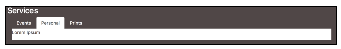
Figure 3.9: Improving the look and feel of our tabs by setting the tab title color to white (example08.html)
With those changes, our Services tabs are a little more pleasing to the eye. The contents of the tabs can now be fleshed out within their own specific container elements.
Source: Jakobus Benjamin, Marah Jason (2018), Mastering Bootstrap 4: Master the latest version of Bootstrap 4 to build highly customized responsive web apps, Packt Publishing; 2nd Revised edition.