I showed you how to create a post in WordPress. Now, I will guide you how to format and style text in the content editor. Note that if you use classic editor, see the article of working with text in the classic content editor. Here, I focus on the default Gutenberg content editor of WordPress.
With default Block Editor
With Classic Editor
1. Anatomy Of The Content Editor
While the Content Editor is built to look and act like word processing software programs, it also has its own unique features. Here are the key parts of the editor.
1.1. Visual vs. Code editor
The Content Editor runs in two different modes: Visual and Text. Visual Mode shows you what your content looks like to visitors, whereas Text Mode displays the raw HTML.

Visual Mode is the default setting for the Content Editor, but you can switch back and forth using the tabs at the top right.
WordPress remembers what you choose and keeps showing the Content Editor in that mode until you switch back.
Visual Mode does not always show you exactly how your content will look to visitors. It all depends on whether the theme you use has styled the Content Editor.
1.2. Gutenberg’s Top Toolbar
Gutenberg’s Top Toolbar is located at the top of the screen and contains a handful of options:

From left to right, the first button that we come across is the WordPress logo. Clicking on this button will take you out of Gutenberg and back into the WordPress back-end. Depending on what you were creating, you will end up in the All Posts, All Pages, or Widgets section.
The next button in the Top Toolbar is the Block Library. When you click on this button, you will see a full list of all available blocks that you can work with.
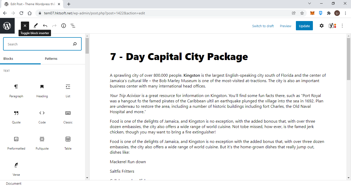
The Block Library consists of two tabs – one for single blocks and one for block patterns.
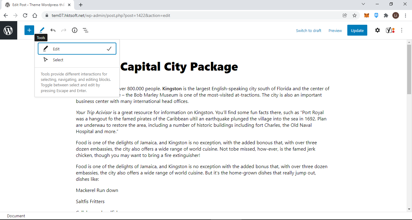
Next, you will see the Tools button. Currently, this option allows you to control what happens when you click on a block with your mouse. You can either start editing the chosen block or you may simply select the block for bulk editing.
The next two buttons are arguably everyone’s favorites – the Undo and Redo buttons. You can use those to undo and redo your edits.
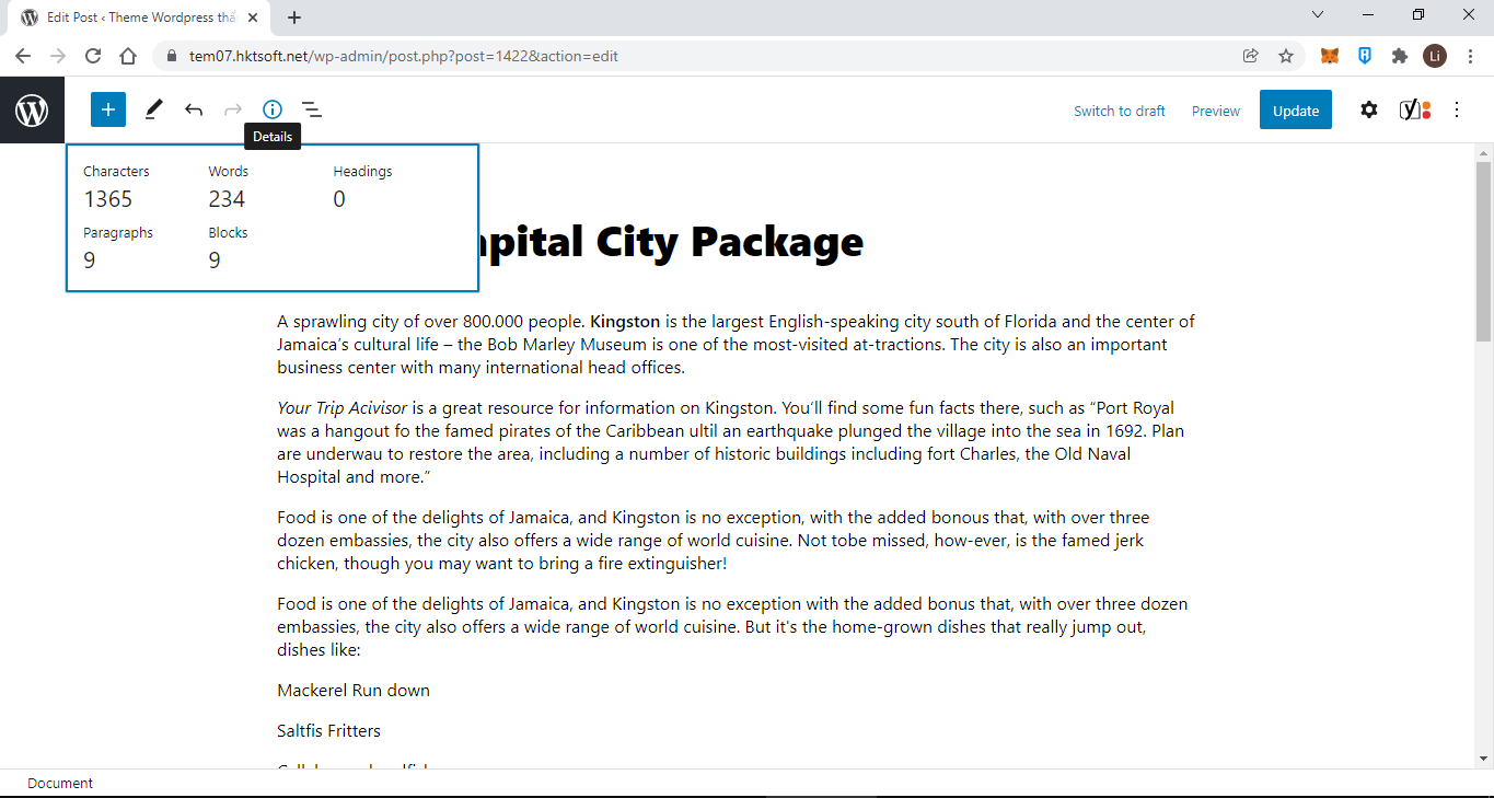
After the Undo and Redo buttons, we get an Information popup. This popup will give you an overview of your content such as how many words you have written, how many paragraphs there are, how many blocks you have used, and more.
Going with the theme of content overviews, the List View shows you an outline of the various blocks that are currently in use. This can be especially helpful in more complex layouts where blocks are nested inside of other blocks. You can click on an element in the List View to jump to that element in the Main Content Area.
If you have used WordPress in the past, you will be familiar with the next three buttons: Save Draft, Preview, and Publish. These allow you to save your changes, see how your content would look like when published, and actually publish your content. Once your content is published, Save Draft will become Switch to Draft and Publish will be replaced by Update.
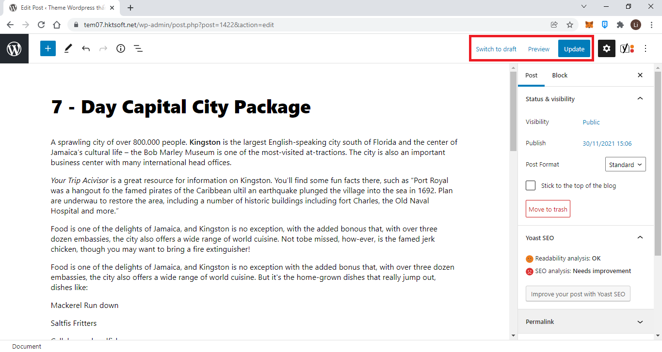
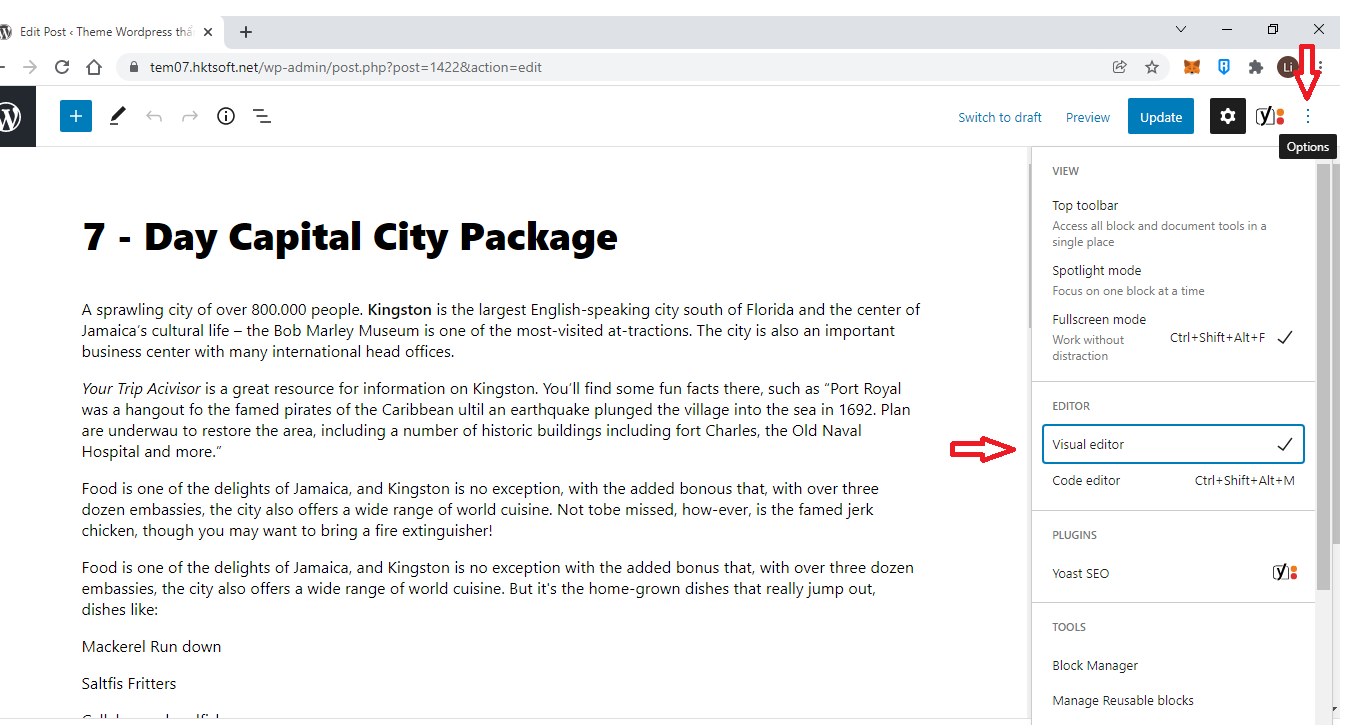
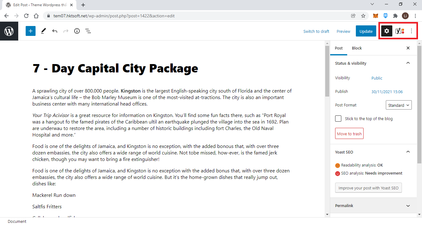
The last two buttons in the Top Toolbar allow you to toggle the Sidebar and to adjust settings related to the Gutenberg editor.
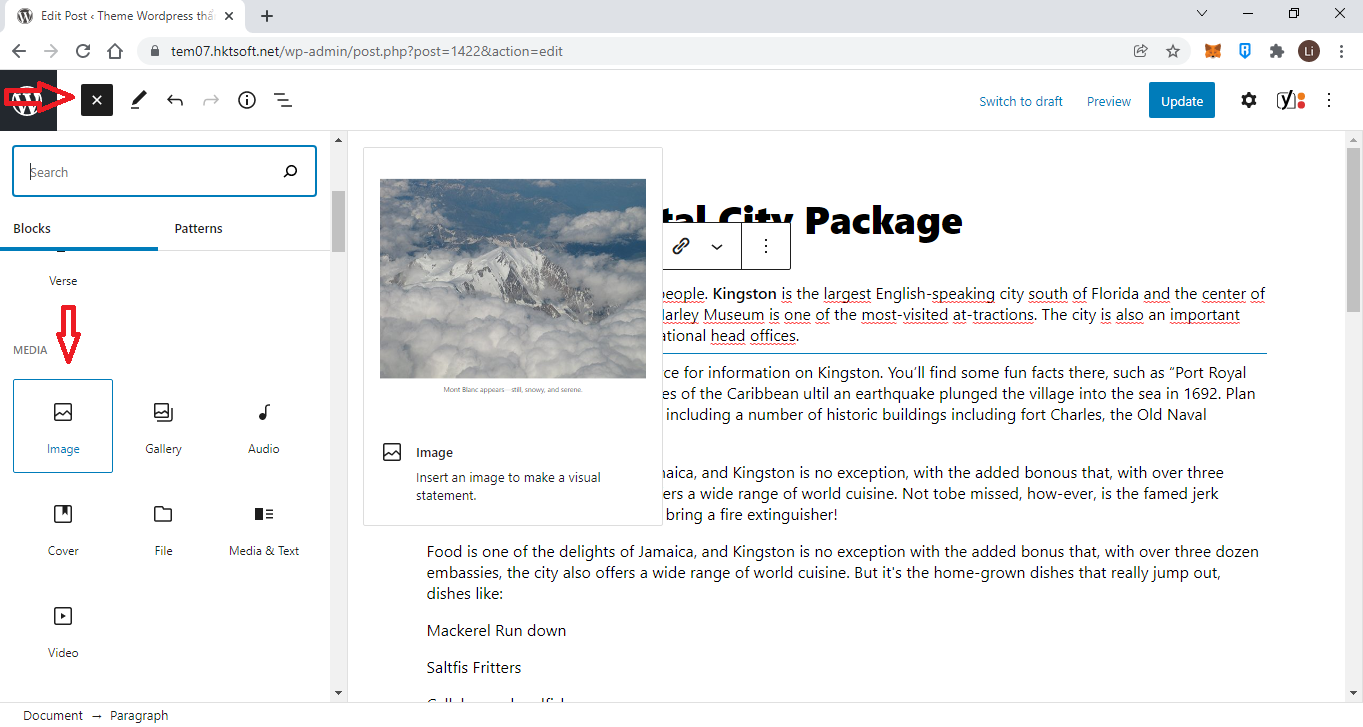
1.3. Add Media
WordPress makes it insanely easier by allowing drag and drop image upload. Just drag the image from your desktop and it will be uploaded instantly.
The most common way of adding images is by using the image block. With this block, you can insert a single image into your post/page.
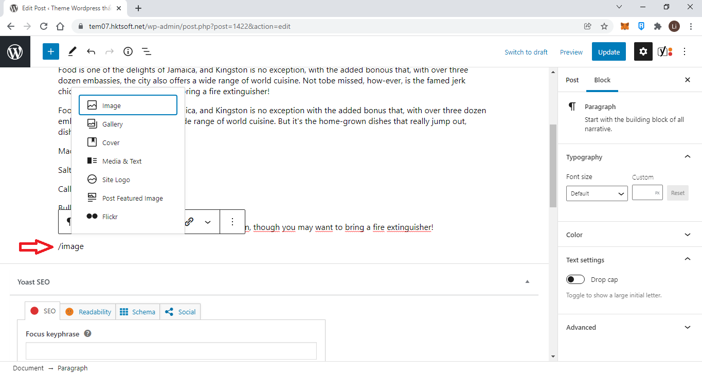
You can choose one from two methods to add the new blocks:
Add the block by clicking on “+” button. Choose the necessary one from the list of available elements.
Or if you know what content you want to add, type “/block_name”.
Once you insert the block into your post/page, you’ll see 3 options.
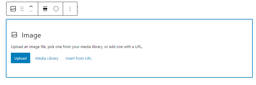
You can either upload an image or choose the image from your WordPress media library. You can also insert an image from a URL.
If you want to upload an image from your computer, click on the ‘Upload’ button and then choose the image and click on ‘Open’.
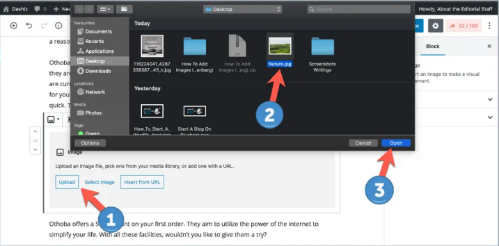
It will be uploaded and added to your content.
Then add caption to the photo

If you want to add an image from your WordPress media library, click on the ‘Media Library’ button, and select the image.
In case of ‘Insert from URL’, simply enter the image URL on the box.
2. Working With The Content Editor
2.1. Styling Text
Styling buttons on the Button Bar, such as Bold or Italic work as follows:
- They’re toggle switches. That means if some text is in italics, clicking the Italic button removes the italics, and vice versa.
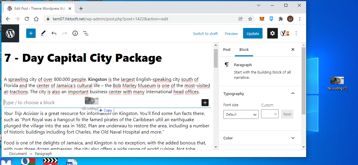
- Highlight the text you want to work with and then click the button to apply the change. I’ll demonstrate by working with some of the text in the first Post for my website. I want to emphasize the name Kingston in the opening sentence and to italicize the name Bob Marley Museum. I simply highlight the text first and click the corresponding button, just like any word processor.

If you prefer working with keyboard shortcuts, those all work in the Content Editor, too. For a complete list of shortcuts, Select the three dots button in the right corner of the screen and then select Keyboard shortcuts.
Bold
Please use this button wisely. If you use too much bold text on a page, the purpose begins to get lost.
Everything becomes important so nothing stands out. Like that.
In addition, bolding is next to all caps, and no one likes writing that “shouts.” Search engines, too, take a dim view of excessive bolding. They can see it as a sign that the author is trying to manipulate the way the page will be interpreted and ranked.
Underlining
I’m not a fan of using the Underline function, at least not on the web. I think it’s just too confus- ing to your visitors, because underlined text spells “link” in their minds. They try clicking the underlined text and you either disappoint or confuse them.
I know some uses of underline are actually required, such as in scholarly documents, but for cases like that, the visitor has some context and is familiar with the underlining. If you need to emphasize text, it’s usually best to stick to bold and italics, or perhaps color.
Coloring Text
Having mentioned coloring text, remember a few things before you start using it:
- Don’t use the same or a similar color as the one you use for your text links—that’s going to confuse visitors. colored headings in your theme, using the same color for pieces
- If you have of text can also be confusing, though a shade of that color may be okay
- Always think about the background color behind the text. You want enough contrast with the background to keep the text readable.
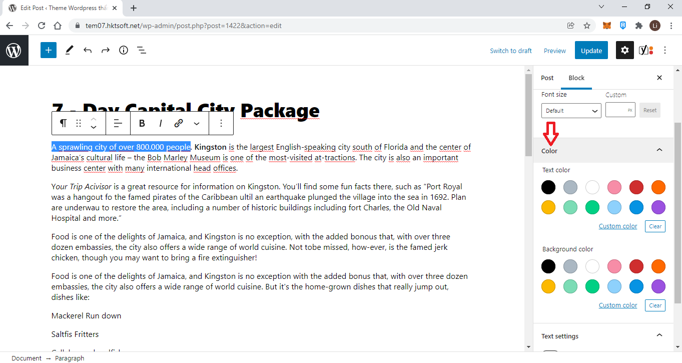
To change the text font color, first, select a block; then click the settings icon on the top right; and then click on color settings. From here, you can change text color along with the background color.
2.2. Formatting Text
Formatting text is another way to help visitors read your content easily, and the Button Bar offers many formatting options. By formatting, I mean how text is structured: paragraphs, lists, groups of paragraphs separated by headings, alignment (left, center, or right), and indenting.
Following are some examples of each of these so that you can more easily associate that look with each button. The exact nature of the look will vary by theme, of course, but the general concept always holds.
Aligning Text
There are three alignment buttons: left, center, and right. To use any one of them, simply place your cursor in the paragraph you want to align, and click the appropriate button. You cannot align a single sentence within a paragraph.
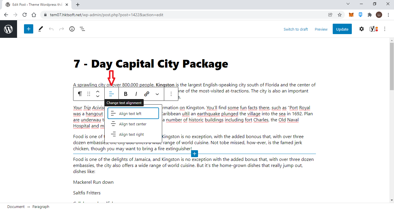
You may think that to return alignment to the normal position of left-aligned, you must click the Left Align button. This works, but it’s better if you simply click the button of your current alignment and thereby toggle it off. HTML defaults to left alignment, so if you just remove the current alignment, the text will be left-aligned.
Blockquotes
Blockquotes are meant to distinguish blocks of text from regular paragraphs, often with some nice styling. As the name suggests, the most common way to use blockquotes is when quoting someone else.
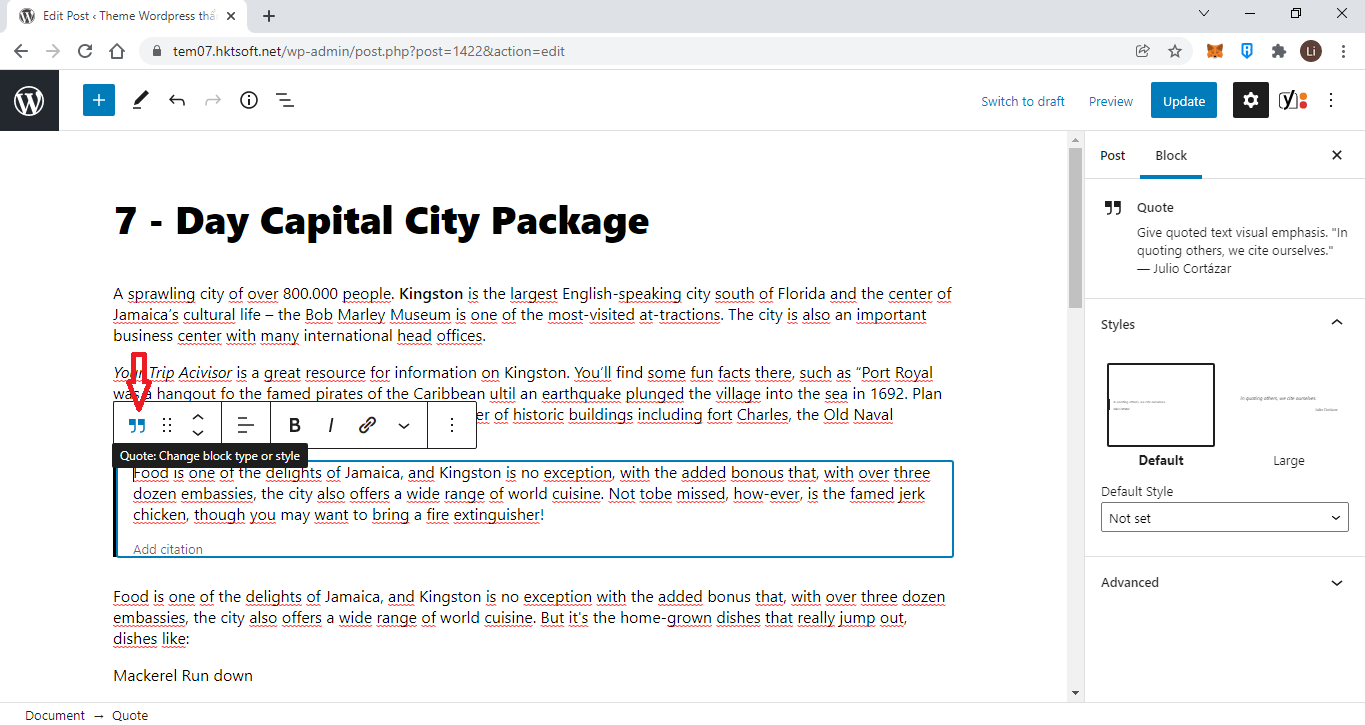
Keep in mind that the font styling you see here is based on the default Twenty Fourteen theme. What you’d see would depend on your theme. One common styling is to indent the left side or even the right side as well.
Applying blockquotes works only on entire paragraphs. If you try to highlight just one sentence of a paragraph, clicking Blockquotes would format the entire paragraph. It follows from that, you need to place your cursor only somewhere in a paragraph to make it all a blockquote.
If you want to make more than one paragraph into a blockquote, you need to highlight the entire group.
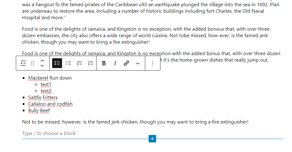
Lists
One of the most effective ways to present information on the Internet is with the use of lists, because they:
- Emphasize points by separating them visually
- Allow the eye to scan through material quickly
- Provide a roadmap when giving instructions or long explanations
- Help readers remember points
WordPress makes it easy to create lists with bullets or with numbers; there’s a button for each on the Button Bar. The basics for each type are the same, so following are a couple specific items.
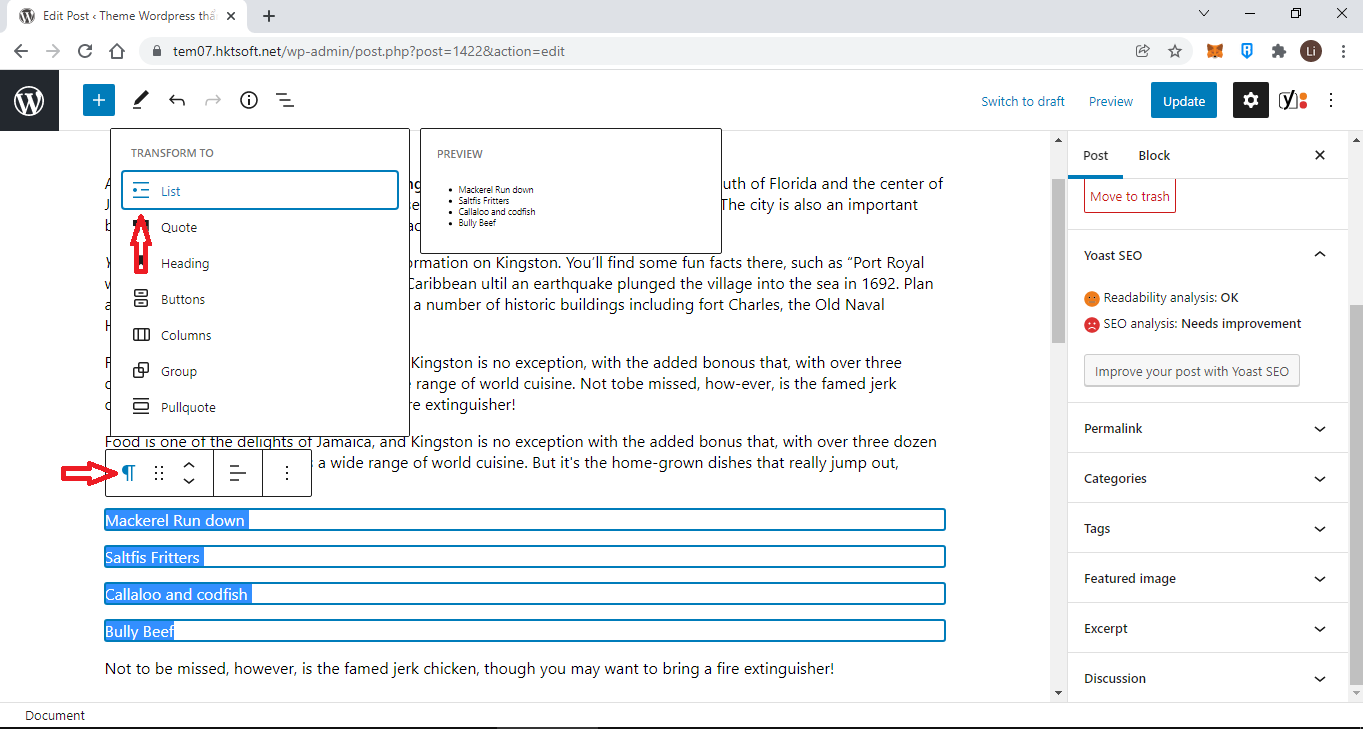
The key to making lists in the Content Editor is to remember that each list item needs to be separated by a return before using the Button Bar. Another way to think of it: Each item needs to be a paragraph.
Assuming, of course, that each of these separated lines follow one after another, creating a list is just a matter of selecting the entire group and clicking one of the list buttons.
Writing a List in the Content Editor
If you create your list in the Content Editor, begin by pressing Return/Enter after the paragraph and before the point where you want to put in the list. Then click the button of the list type you want.
A bullet or number appears, and you can begin writing the first list item. Press Return/Enter at the end of the item, and another bullet or number appears. Repeat until you complete the list.
When you finish, press Return/Enter once. You see a bullet or a number; then press a second time. The bullet or number disappears, meaning the list is complete, and you’re on a new line ready to start writing a new paragraph.
Multilevel Lists
If you have complex lists with sublevels, WordPress can handle that using the Indent buttons in combination with the List function.
To create a subitem, press Enter to start a new list item, and then press the Increase Indent button. The list item moves to the right, and for numbered lists, you see numbering begin again for the new level. For bulleted lists, the bullet for the new level may be the same or different, depending on your theme.
The Decrease Indent button moves a list item to the left and returns the bullet or number to the type for that level of the list.
You can see a new multilevel version of my food list in bulleted form on the left and using a numbered list on the right.
The number of levels you can have is limited only by the width of your content area.
The Formatting Drop-down
Paragraph
The default formatting when you enter text in the Content Editor is a paragraph. Even a single line of text followed by a return creates a paragraph in the technical sense of having HTML paragraph tags.
About the only time you need to use the Formatting drop-down for paragraphs is when you want to change some text back from some other format.
Paragraphs by default are left-aligned and their styling is controlled by the theme’s style sheets.
Preformatted
The Preformatted is preformatted content, and the idea here is that the text in question has a particular spacing, and the job of this tag is to preserve it. By default, HTML ignores white space and puts a single space between elements. The pre tag, however, maintains the original white space.
Usually the pretag displays using a fixed width font, such as Courier (the typewriter font), and sometimes without any word-wrap function. Coupled with the ability to maintain the original white space, the tag is often used for displaying computer code; though there is a specific HTML tag called “code” for that purpose.
Headings 1 Through 6
Many people try out the formatting menu and discover that if they use one of the Heading settings, they can make their text look different (larger, bolder, and so on). But this is a misuse of headings.
The reason your theme styles each heading differently is to help visitors see the relationships between headings. The numbers 1 through 6 are derived from the HTML tags h1, h2, and so on. Heading 1 is meant to be the most important on a page, or as of HTML5, the most important within an HTML Section. Heading 2 is less important, and so on down the line.
And the term Heading is also important here. It means a word or short phrase. A series of two sentences is not a heading. Headings introduce and mark out groups of paragraphs and other content.
Consider this outline:
Heading 1
Heading 2A
Heading 3A
Heading 3B
Heading 2B
Heading 3C
Heading 3D
The H1 tells you the overall topic, the two H2s divide that topic in some related way, and the H3s divide their respective areas in some further way.
The value to visitors is tremendous. By glancing at the wording of the headings, they should get a good sense of what the page covers, while the styling of each heading conveys the importance of relationships between the segments.
If you use Headings to divide up your content and make its structure clearer to visitors (and search engines), make sure you are clear and consistent with the different levels of headings. Unless you know what you’re doing, for example, there should be only one H1 on the page, and that should be the Title of the Post or Page. Your theme should take care of that automatically, so do not to use H1 in the Content Editor.