This article will guide you how to format and style text in the content editor. The first you should to know is that The Content Editor runs in two different modes: Visual and Text. Visual Mode shows you what your content looks like to visitors, whereas Text Mode displays the raw HTML. Visual Mode is the default setting for the Content Editor, but you can switch back and forth using the tabs at the top right. WordPress remembers what you choose and keeps showing the Content Editor in that mode until you switch back.
With default Block Editor
With Classic Editor
1. Anatomy Of The Content Editor
While the Content Editor is built to look and act like word processing software programs, it also has its own unique features. Here are the key parts of the editor.
1.1. Visual vs. Text Mode
The Content Editor runs in two different modes: Visual and Text. Visual Mode shows you what your content looks like to visitors, whereas Text Mode displays the raw HTML. Figure 7-1 shows the same content viewed in Visual Mode (left) and Text Mode (right).
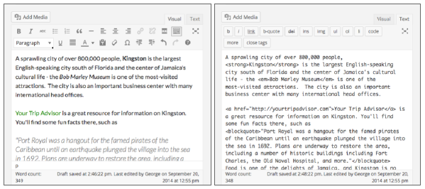
FIGURE 7-1
Visual Mode is the default setting for the Content Editor, but you can switch back and forth using the tabs at the top right, as shown in Figure 7-2.
WordPress remembers what you choose and keeps showing the Content Editor in that mode until you switch back.
Visual Mode does not always show you exactly how your content will look to visitors. It all depends on whether the theme you use has styled the Content Editor. WordPress has a default styling, so you can always see a kind of WYSIWYG(What You See Is What You Get) in Visual Mode, but to exactly match what visitors will see, it depends on your theme.
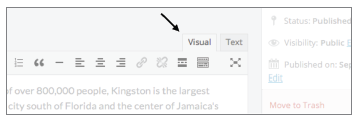
FIGURE 7-2
One sign of a well-written theme is that it matches the styling of the Content Editor with the styling on the front end of the site. Keep this in mind when learning about choosing a theme in Lesson 27, “Overview of WordPress Themes.”
1.2. Add Media
The Add Media button enables you to add images, documents, video, and audio to your content. The button is located at the top left of the Content Editor, as shown in Figure 7-3.
Just as you saw with Featured Images in Lesson 6, this button pops up a Media Upload Window, as shown in Figure 7-4.
Referring to Figure 7-4, you can see the window opened at the Upload Files tab, but it may open at the Media Library tab, depending on what you did last with uploading media.
By default, this window shows all the images in your Media Library, but because you haven’t uploaded anything yet, it’s showing the Select Files option to browse your computer or mobile device. When there’s something in the Media Library, you need to click the Upload Files tab at the top left. You can also drag and drop to the upload area.
After an image uploads, it displays both in the media library listing and on the right.
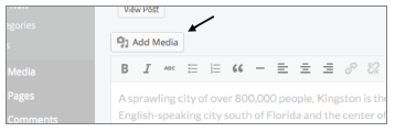
FIGURE 7-3
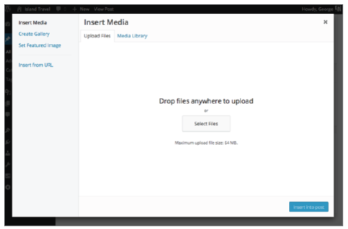
FIGURE 7-4
The lessons in Section IV, “Working with Media Content,” go into detail about the Media Upload Window and about adding various types of media to your content, as well as how to lay out images and other media within text.
1.3. The Status Bar
After you begin entering content, the bottom area of the Content Editor displays some useful information, as shown in Figure 7-5.
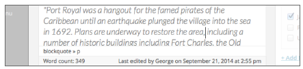
FIGURE 7-5
On the bottom left is the word count, and on the right is the last date and time the content was edited, with the name of the user who made the edits.
The area above the word count tells you what HTML tags are governing the text your cursor is pointing to. Referring to Figure 7-5, for example, it says blockquote >> p, which means this text has a paragraph tag within a blockquote tag. If you click a tag, the content editor highlights the relevant text. Be aware that the HTML tag status line only displays in Visual Mode.
1.4. The Button Bar
The Button Bar is the heart of the Content Editor, providing all the tools for styling and formatting your content. You’ll sometimes see it referred to as the toolbar, but because the area at the top of admin screens has that name, and the icons all act like little buttons, I prefer to say Button Bar.
In Visual Mode it resembles a word processor, and in Figure 7-6 you see the default Button Bar, with each button labeled for reference.
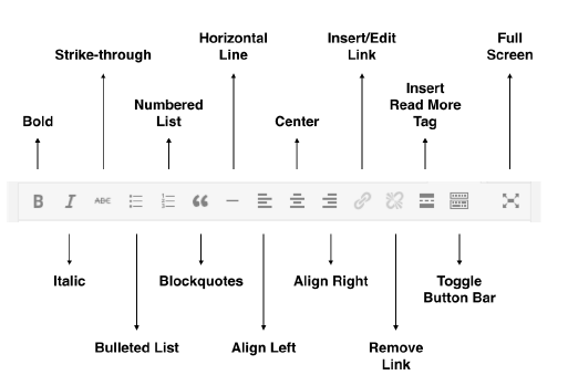
FIGURE 7-6
Now consider the second row of key buttons. On the right side of the first row there’s the Toolbar Toggle button (for a long time this was called Kitchen Sink), as shown in Figure 7-7.
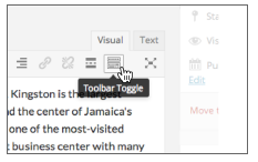
FIGURE 7-7
Clicking this button reveals the second row of buttons, and they’ll stay visible until you click the Toolbar Toggle again.
Figure 7-8 shows this second row of buttons with their functions.

FIGURE 7-8
On mobile browsers, the Button Bar looks and operates exactly the same way, except, of course, the width of it causes some narrower screens to take two lines per row. Having both rows open at the same time makes for a cumbersome Button Bar on smartphones, as shown in Figure 7-9.
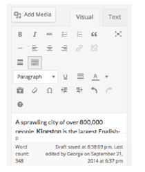
FIGURE 7-9
This is a good reason for mobile users to toggle the second row off most of the time, and display it only as needed.
2. Working With The Content Editor
Although you’ll hear some people say that aspects of working with the Content Editor in Visual Mode can be frustrating, it’s still the easiest way for the average user to work with content. That’s why this lesson is conducted in Visual Mode. Included are some tips that can help smooth over those minor quirks, but they’re few and far between, and the advantages of Visual Mode far outweigh such issues.
2.1. Sizing the Content Editor
Up until WordPress 4.0, working with large amounts of content meant resizing the height of the Content Editor or making sure your cursor was inside the Content Editor before scrolling (or else you’d end up scrolling the entire browser window).
Now the Content Editor automatically scrolls no matter where you have your cursor and no matter how long the content. This is why you won’t find any resizing option—you don’t need it.
Distraction Free Writing Button
You can resize the Content Editor by clicking the Distraction Free Writing button on the far right of the Button Bar (in Visual or Text Mode). (This button used to be called Full Screen and I still think of it in those terms.)
The idea is to get rid of any other boxes on the screen and let you focus on writing. Figure 7-10 compares the same Post in regular screen mode on the left and Distraction Free Writing on the right.
Referring to the right side of Figure 7-10, you may ask, “Where’s the Button Bar?” To keep you focused on writing, WordPress hides any options until you mouseover the top portion of the screen.
At that point you can access all key functions, including Update and Exit full screen mode, as shown in Figure 7-11.
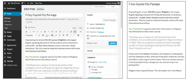
FIGURE 7-10
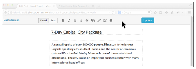
FIGURE 7-11
You might also ask where the Add Media button has gone in Distraction Free Writing mode. It’s now an icon—the one near the middle that looks like a camera and music notes. Clicking that button produces the usual Media Upload Window.
2.2. Styling Text
Styling buttons on the Button Bar, such as Bold or Italic work as follows:
- They’re toggle switches. That means if some text is in italics, clicking the Italic button removes the italics, and vice versa.
- Highlight the text you want to work with and then click the button to apply the change. I’ll demonstrate by working with some of the text in the first Post for my website. I want to emphasize the name Kingston in the opening sentence and to italicize the name Bob Marley Museum. As shown in Figure 7-12, I simply highlight the text first and click the corresponding button, just like any word processor.
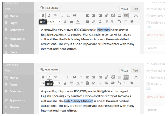
FIGURE 7-12
If you prefer working with keyboard shortcuts, those all work in the Content Editor, too. (For a complete list of shortcuts, click the question mark icon on the Button Bar.)
Lesson 6 mentions that WordPress usually retains most types of basic styling when you copy and paste text from a program such as Word. But it’s always important to check for any that might have been missed.
WARNING If you copy from a web document, it’s better to use the Paste from Text button on the Button Bar. It will strip out HTML that could interfere with how your theme styles the text.
Although WordPress provides you with powerful tools for styling your text, with any power comes responsibility. The following suggestions aren’t about WordPress, but they’re important for your visitors.
Bold
Please use this button wisely. If you use too much bold text on a page, the purpose begins to get lost.
Everything becomes important so nothing stands out. Like that.
In addition, bolding is next to all caps, and no one likes writing that “shouts.” Search engines, too, take a dim view of excessive bolding. They can see it as a sign that the author is trying to manipulate the way the page will be interpreted and ranked.
Underlining
I’m not a fan of using the Underline function, at least not on the web. I think it’s just too confus- ing to your visitors, because underlined text spells “link” in their minds. They try clicking the underlined text and you either disappoint or confuse them.
I know some uses of underline are actually required, such as in scholarly documents, but for cases like that, the visitor has some context and is familiar with the underlining. If you need to emphasize text, it’s usually best to stick to bold and italics, or perhaps color.
Coloring Text
Having mentioned coloring text, remember a few things before you start using it:
- Don’t use the same or a similar color as the one you use for your text links—that’s going to confuse visitors. colored headings in your theme, using the same color for pieces
- If you have of text can also be confusing, though a shade of that color may be okay
- Always think about the background color behind the text. You want enough contrast with the background to keep the text readable.
How, then, do you color text? It’s the button with the letter A, on the second row of the Button Bar. If you highlight some text and click that button, the text turns the color of the small bar displayed at the base of the button. If you want to change that color, click the down arrow and you see some preset choices. Click More Colors and you see a pop-up window where you can choose from any color, as shown in Figure 7-13 A.
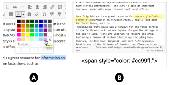
FIGURE 7-13
I often see people create special styles for a section heading. Those headings are already controlled by your theme. Creating a style for a particular heading overrides what’s in the style sheet, and that’s okay, but maybe what you actually want to do is change the style sheet so that all headings of that type look the same. Lesson 29, “Advanced Design Customization,” mentions how a change like that could be made.
2.3. Formatting Text
Formatting text is another way to help visitors read your content easily, and the Button Bar offers many formatting options. By formatting, I mean how text is structured: paragraphs, lists, groups of paragraphs separated by headings, alignment (left, center, or right), and indenting.
Following are some examples of each of these so that you can more easily associate that look with each button. The exact nature of the look will vary by theme, of course, but the general concept always holds.
Aligning Text
There are four alignment buttons: left, center, and right alignment are on the first row of the Button Bar, and justified alignment is on the second row. To use any one of them, simply place your cursor in the paragraph you want to align, and click the appropriate button. You cannot align a single sentence within a paragraph.
You may think that to return alignment to the normal position of left-aligned, you must click the Left Align button. This works, but it’s better if you simply click the button of your current alignment and thereby toggle it off. HTML defaults to left alignment, so if you just remove the current alignment, the text will be left-aligned.
Blockquotes
Blockquotes are meant to distinguish blocks of text from regular paragraphs, often with some nice styling. As the name suggests, the most common way to use blockquotes is when quoting someone else. Figure 7-17 shows you how it works in our sample package.
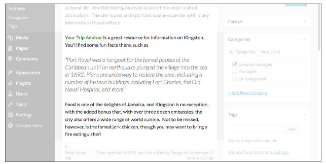
FIGURE 7-17
Keep in mind that the font styling you see here is based on the default Twenty Fourteen theme. What you’d see would depend on your theme. One common styling is to indent the left side or even the right side as well.
Applying blockquotes works only on entire paragraphs. If you try to highlight just one sentence of a paragraph, clicking Blockquotes would format the entire paragraph. It follows from that, you need to place your cursor only somewhere in a paragraph to make it all a blockquote.
If you want to make more than one paragraph into a blockquote (assuming they’re all in a row), you need to highlight the entire group.
Lists
One of the most effective ways to present information on the Internet is with the use of lists, because they:
- Emphasize points by separating them visually
- Allow the eye to scan through material quickly
- Provide a roadmap when giving instructions or long explanations
- Help readers remember points
WordPress makes it easy to create lists with bullets or with numbers; there’s a button for each on the Button Bar. The basics for each type are the same, so following are a couple specific items.
The key to making lists in the Content Editor is to remember that each list item needs to be separated by a return before using the Button Bar. Another way to think of it: Each item needs to be a paragraph.
Assuming, of course, that each of these separated lines follow one after another, creating a list is just a matter of selecting the entire group and clicking one of the list buttons. You can see the before and after in Figure 7-18.
The result is a bulleted list. As always, the exact way it looks depends on your theme.
Writing a List in the Content Editor
If you create your list in the Content Editor, begin by pressing Return/Enter after the paragraph and before the point where you want to put in the list. Then click the button of the list type you want.
A bullet or number appears, and you can begin writing the first list item. Press Return/Enter at the end of the item, and another bullet or number appears. Repeat until you complete the list.
When you finish, press Return/Enter once. You see a bullet or a number; then press a second time. The bullet or number disappears, meaning the list is complete, and you’re on a new line ready to start writing a new paragraph.
Pasting List Items into the Content Editor
If you paste a list of items into the Content Editor, WordPress may display it as a list immediately. It all depends on the source. Lists from Word, for example, should carry over just fine.
However, if your list is not formatted after pasting (Figure 7-19 A), you need to manually do it. The problem is, highlighting your list items and clicking a list button is likely to produce something odd: a single bullet or number, with all the original items as one list item, as shown in Figure 7-19 B.
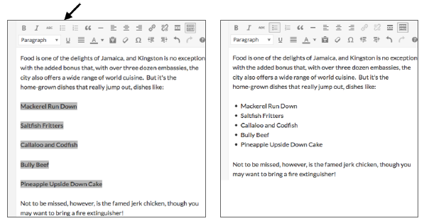
FIGURE 7-18
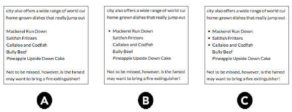
FIGURE 7-19
No worries; just put your cursor at the beginning of each original item and press Return/Enter. Figure 7-19 C shows you the result part way through the process: A bullet or number appears each time you do this, until your list is fully formatted.
Multilevel Lists
If you have complex lists with sublevels, WordPress can handle that using the Indent buttons in combination with the List function.
To create a subitem, press Return/Enter to start a new list item, and then press the Increase Indent button. The list item moves to the right, and for numbered lists, you see numbering begin again for the new level. For bulleted lists, the bullet for the new level may be the same or different, depending on your theme.
The Decrease Indent button moves a list item to the left and returns the bullet or number to the type for that level of the list.
You can see a new multilevel version of my food list in Figure 7-20 in bulleted form on the left and using a numbered list on the right:

FIGURE 7-20
The number of levels you can have is limited only by the width of your content area.
The Formatting Drop-down
The drop-down menu on the second row of the Button Bar is one of the most misunderstood and misused elements of the Content Editor. Following is a description of each of the formats in the order on the drop-down.
Paragraph
The default formatting when you enter text in the Content Editor is a paragraph. Even a single line of text followed by a return creates a paragraph in the technical sense of having HTML paragraph tags.
About the only time you need to use the Formatting drop-down for paragraphs is when you want to change some text back from some other format.
Paragraphs by default are left-aligned and their styling is controlled by the theme’s style sheets.
Address
Despite the name, do not use this to format a mailing address. The address tag is actually intended to designate the contact information for the author of a web page or a portion of a page designated in HTML as an article. Typically, that contact information would be an e-mail address, a web link, a Skype handle, and so on.
Even though your theme gives this a particular styling, do not simply use it for styling. Search engines and other web reader functions look within this tag for specific kinds of contact information.
Pre
The “pre” is short for preformatted content, and the idea here is that the text in question has a particular spacing, and the job of this tag is to preserve it. By default, HTML ignores white space and puts a single space between elements. The pre tag, however, maintains the original white space, as shown in Figure 7-21.
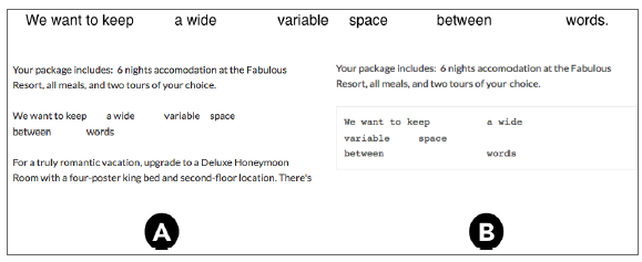
FIGURE 7-21
You can see in Figure 7-21 A how the Content Editor tried to keep some of the spacing, but when the preformat was applied in Figure 7-21 B, all the spacing displayed exactly as in the original.
Usually the pretag displays using a fixed width font, such as Courier (the typewriter font), and sometimes without any word-wrap function. Coupled with the ability to maintain the original white space, the tag is often used for displaying computer code; though there is a specific HTML tag called “code” for that purpose.
Headings 1 Through 6
Many people try out the formatting menu and discover that if they use one of the Heading settings, they can make their text look different (larger, bolder, and so on). But this is a misuse of headings.
The reason your theme styles each heading differently is to help visitors see the relationships between headings. The numbers 1 through 6 are derived from the HTML tags h1, h2, and so on. Heading 1 is meant to be the most important on a page, or as of HTML5, the most important within an HTML Section. Heading 2 is less important, and so on down the line.
And the term Heading is also important here. It means a word or short phrase. A series of two sentences is not a heading. Headings introduce and mark out groups of paragraphs and other content.
Consider this outline:
Heading 1
Heading 2A
Heading 3A
Heading 3B
Heading 2B
Heading 3C
Heading 3D
The H1 tells you the overall topic, the two H2s divide that topic in some related way, and the H3s divide their respective areas in some further way.
The value to visitors is tremendous. By glancing at the wording of the headings, they should get a good sense of what the page covers, while the styling of each heading conveys the importance of relationships between the segments.
If your goal is simply to style text, do not use Headings. If you don’t know how to use CSS to achieve specialized styling, plugins can help go beyond the default Content Editor. See the end of this lesson for some suggestions.
If you use Headings to divide up your content and make its structure clearer to visitors (and search engines), make sure you are clear and consistent with the different levels of headings. Unless you know what you’re doing, for example, there should be only one H1 on the page, and that should be the Title of the Post or Page. Your theme should take care of that automatically, so do not to use H1 in the Content Editor.